
Case study 01
Sagac Public Affairs Brand Refresh
A study of the holistic brand refresh that I led at Sagac Public Affairs, including the redesign of their logo, design aesthetic, marketing collateral, and motion design.
At a glance
Overview
-
01
Challenge
Refresh Sagac’s identity ahead of its 25th anniversary while making the brand more flexible across digital, social, motion, and print applications.
-
02
Approach
Developed a new icon based on an abstract “S” and directional arrows while preserving recognizable elements of the existing brand.
-
03
Execution
Explored and refined multiple directions before developing the final logo system, brand guidelines, collateral, and motion applications.
-
04
Collaboration
Initiated the project and worked with marketing and leadership to build support, present concepts, incorporate feedback, and guide the identity toward a final direction.
-
05
Outcome
Created a more flexible identity system with multiple logo configurations, a standalone icon, and guidelines for consistent application across the brand.
- Year-old firm, refreshed for its anniversary
- 25
- Rounds of concept development
- 5
- Logo configurations, including a standalone icon
- 6
Before & after
From a horizontal-only wordmark to a flexible system

The pitch
Initial Phase of Sagac Rebranding Efforts
Sagac Public Affairs was founded in 1999 by Trey and Jeri Richardson. Sagac began preparations at the end of 2023 for the celebration of its 25th anniversary in 2024. Having been with the company for a year at that point, I had had the opportunity to work on developing marketing materials for the company and realized that there were some limitations with its current branding. The logo was solely horizontal and created scaling issues when needing to use the logo in more vertical applications. The bar below Sagac didn’t seem to serve any meaningful purpose and looked awkward. There was an opportunity to create an icon mark for the company that would be instantly associated with the company rather than just the wordmark alone. This icon mark could be utilized in social media profile pictures, in motion pieces, and on merchandise to unify the brand cohesion across the company.
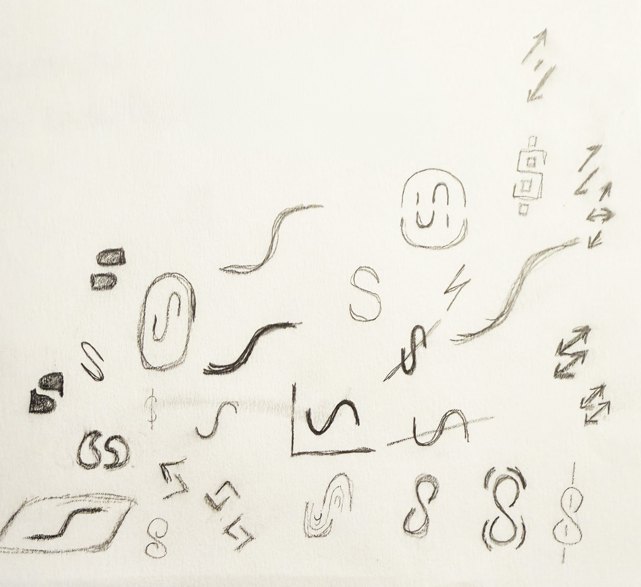
I felt like a 25th anniversary was a fantastic time to launch a newly refreshed brand, so I began some initial sketches. From the sketches, I transitioned to Adobe Illustrator and worked up some initial options. I quietly discussed them with the marketing department to gauge whether the board of directors might be open to the idea. Once I had them on board with the pitch, I discussed the idea with my boss, the Chief Creative Officer of Sagac Public Affairs and cofounder of the company, Jeri Richardson. She was open to the idea. I presented my initial designs to Jeri.
Round 1
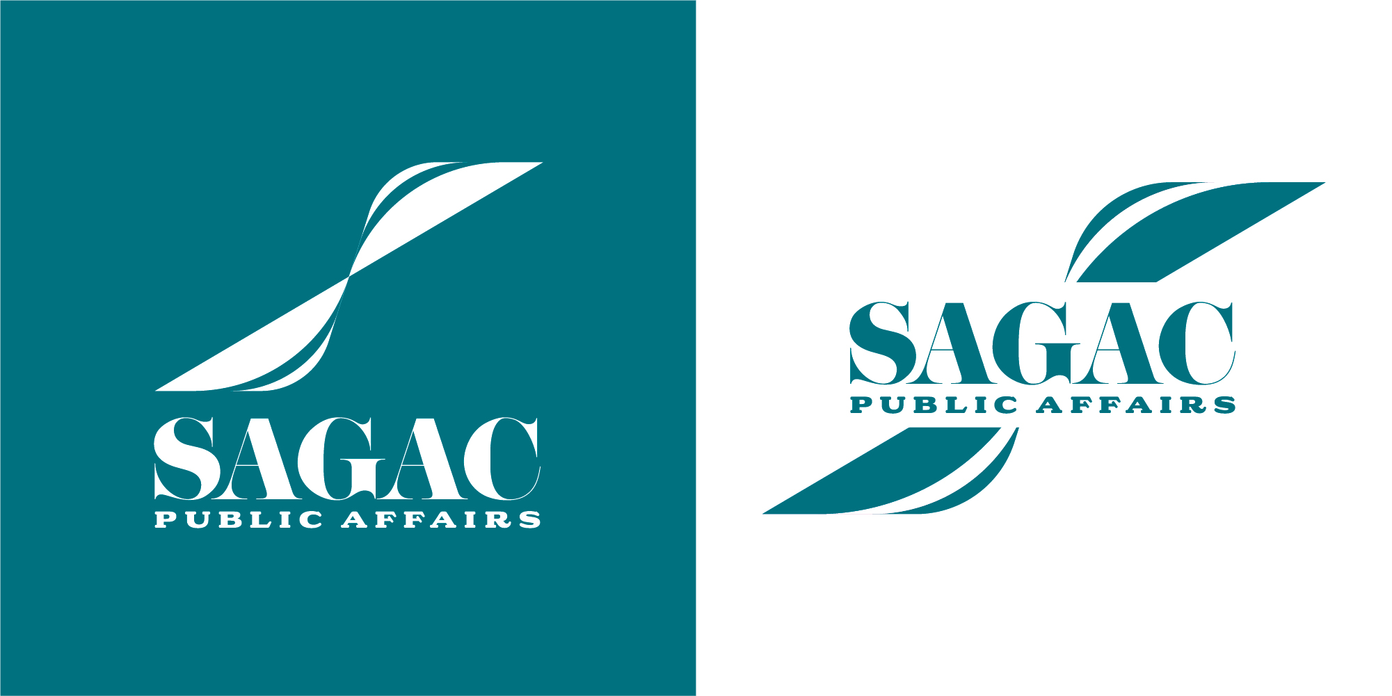
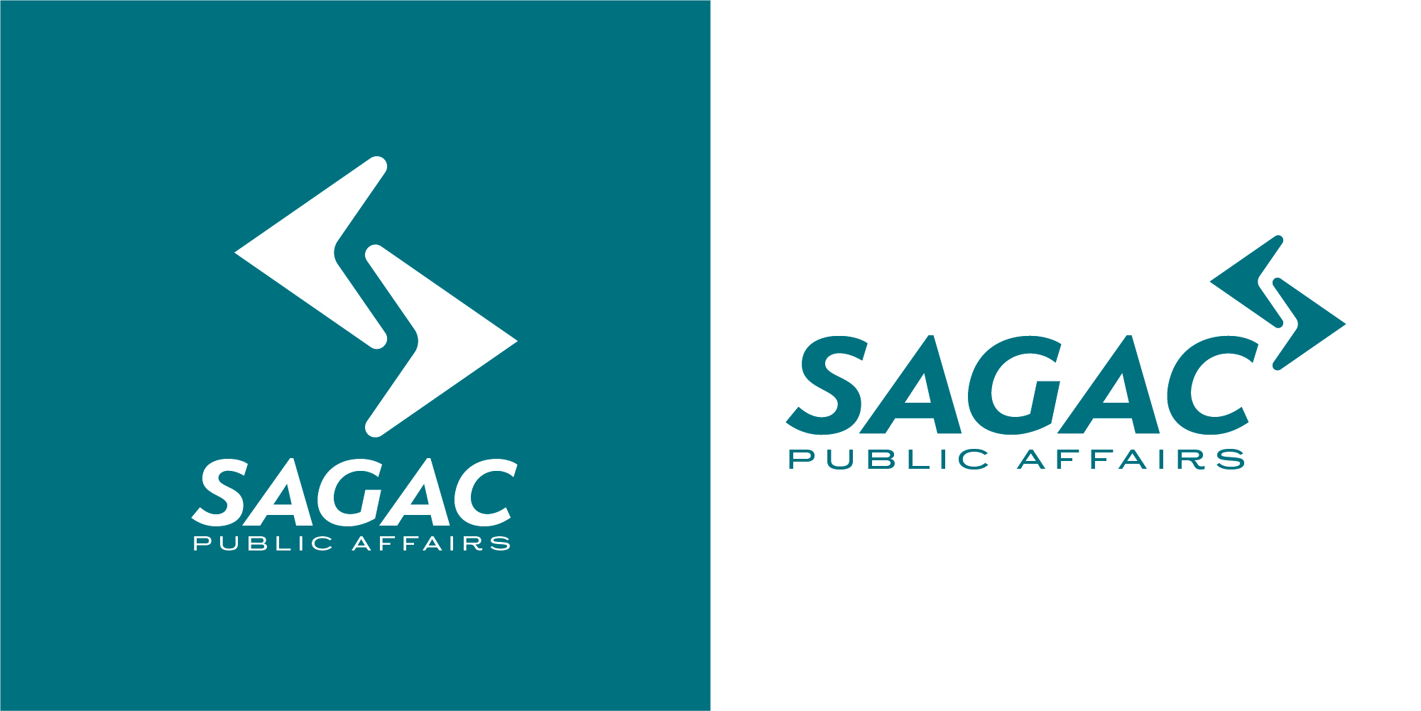
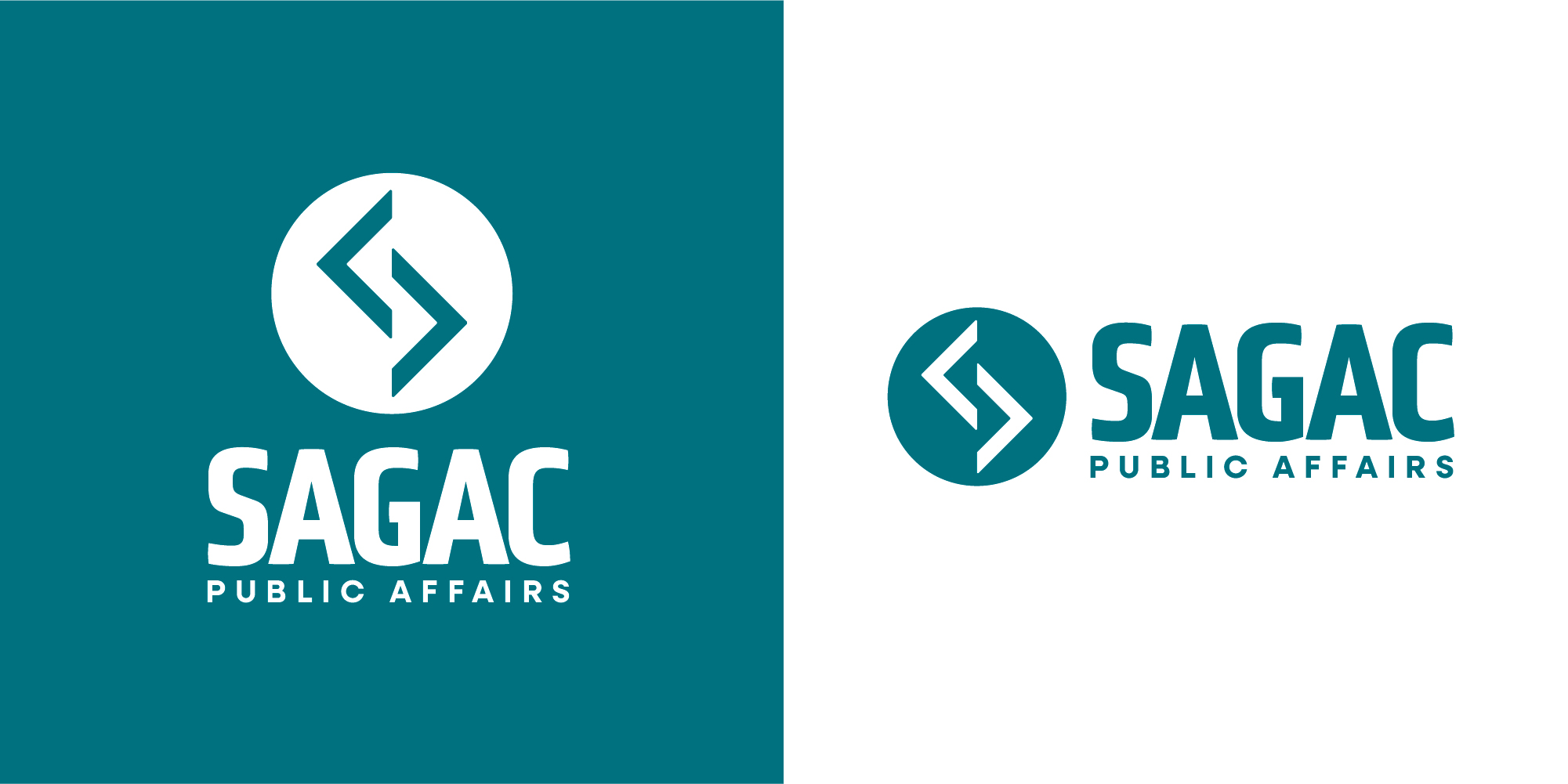
Sagac Logo Refresh Round 1
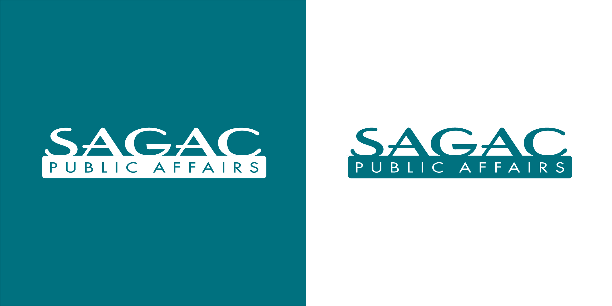
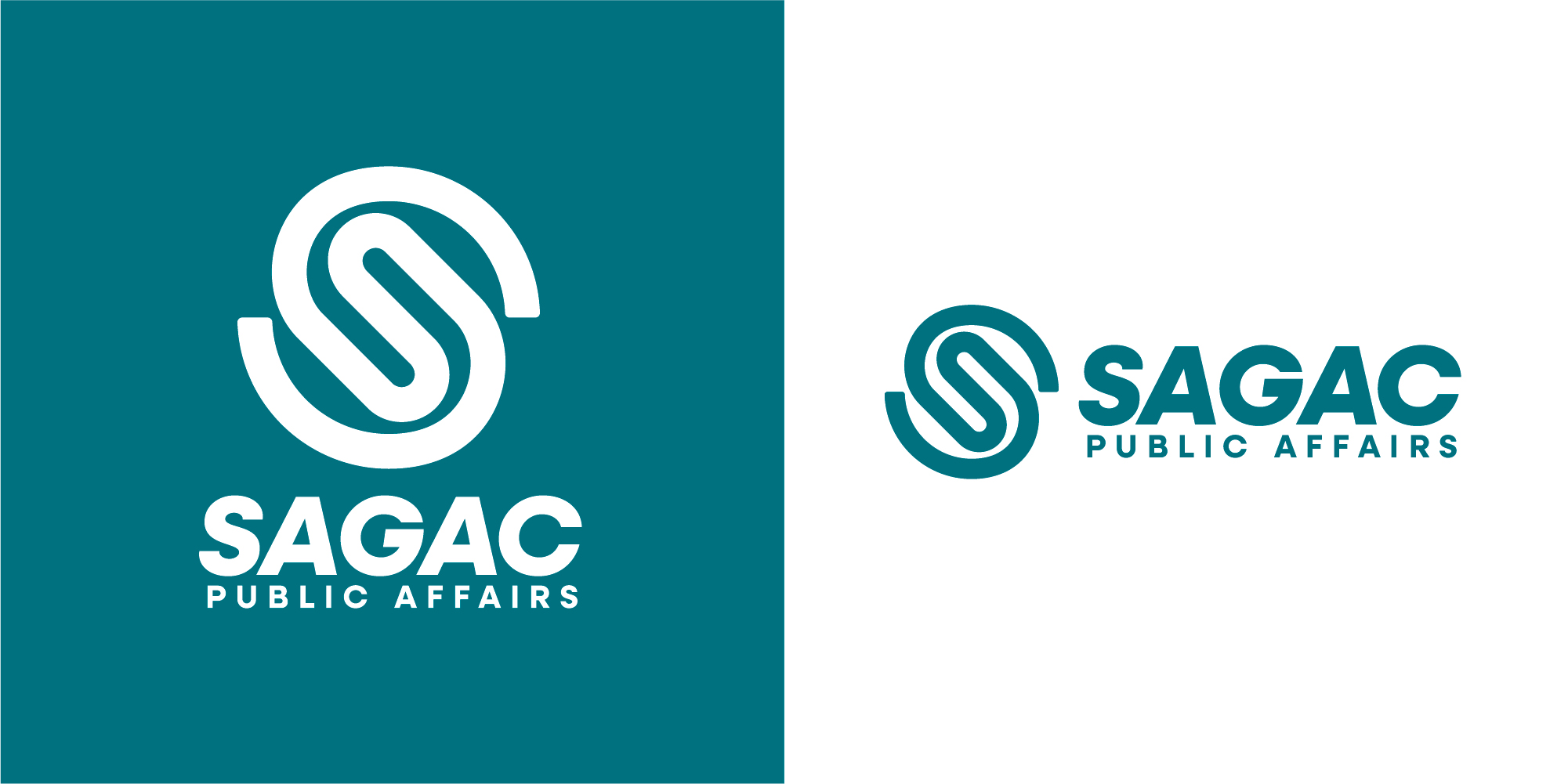
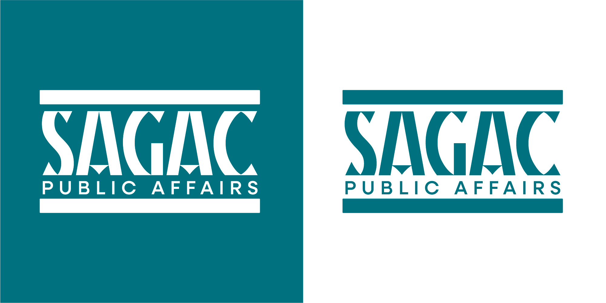
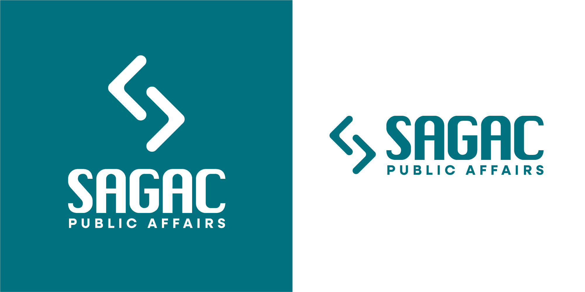
Here I presented the original Sagac Logo along with options that ranged from incremental improvements all the way to completely new concepts. When I presented these options to Jeri, I also presented them in potential new colorways to gauge willingness to move away from the green and orange brand colors.
Round 2
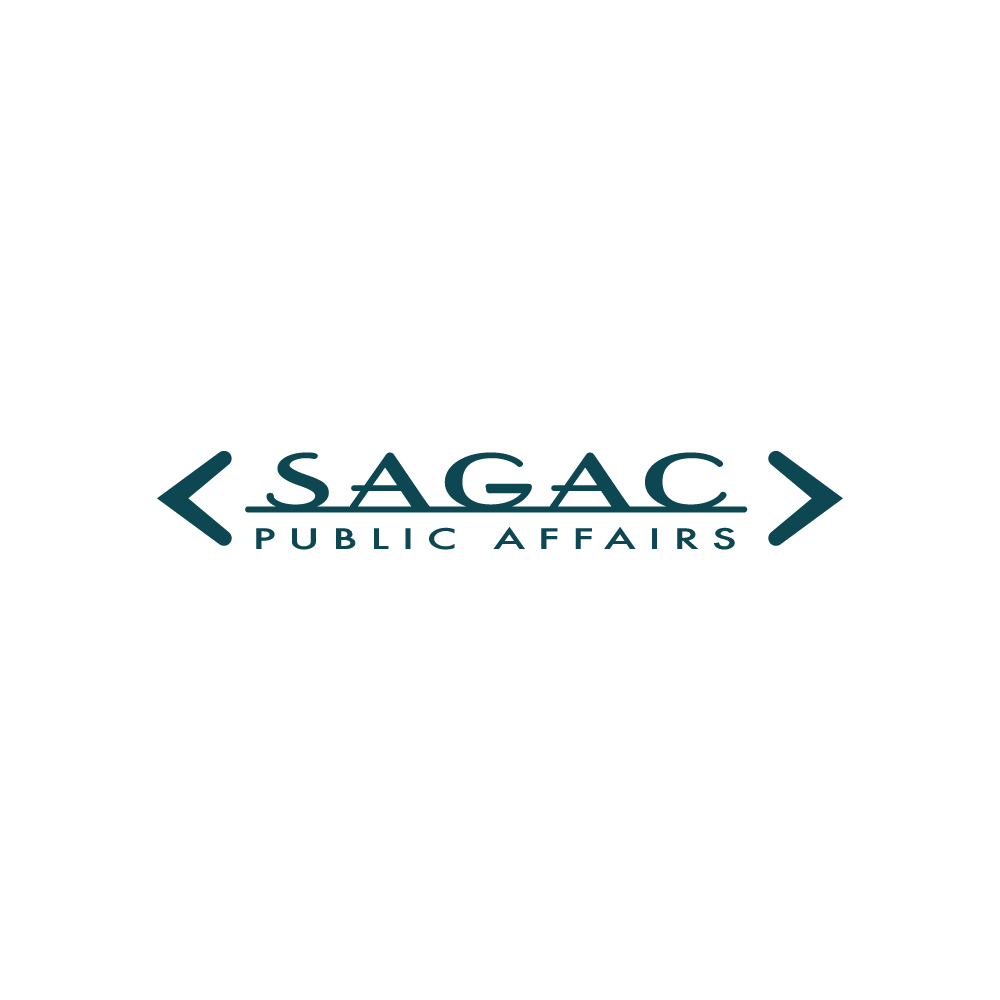
Sagac Logo Refresh Round 2
Jeri provided some feedback after the initial concepts. She really liked the arrows concept and definitely saw the vision, but she wasn’t quite ready to abandon the existing wordmark. I agreed that keeping a modified version of the original wordmark in conjunction with the arrows icon could provide a refreshed brand without losing all of the established brand equity. I took the arrow design and went back and iterated a variety of ideas using the arrows, including some explorations of the arrows on either side of the original wordmark that Jeri wanted me to explore. Jeri also requested that I work up some options of an icon that utilized the S from the original wordmark. She wasn’t open to exploring new colors, so we kept everything in the green and orange moving forward.

Round 3
Sagac Logo Refresh Round 3
Following some additional explorations, we narrowed down to a final set of concepts that we would present to the entire company to get their input. At this presentation, reception was nearly universally positive. One important exception was one of the partners who felt that the arrows looked too much like the SS symbol. As designers, we are always sensitive to the potential for logos to resemble any sort of hate symbols or hidden imagery that garners any negative feelings. We felt like these logo options didn’t have any of those potential negative connotations, but out of a sense of abundance of caution, we decided to explore some additional options for the arrow designs.
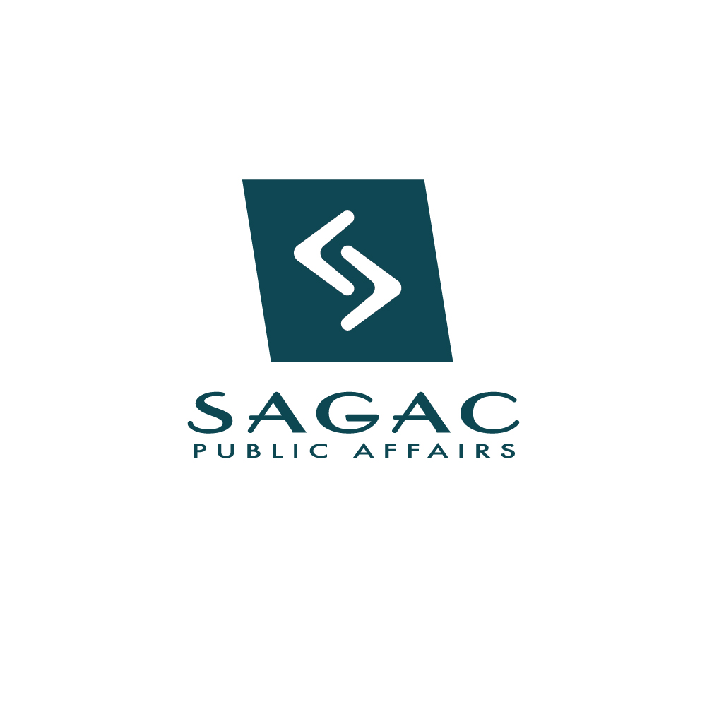
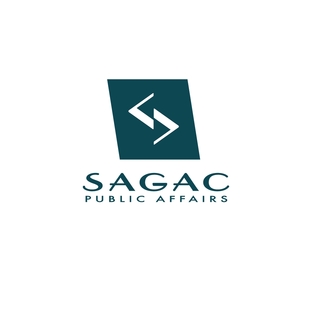
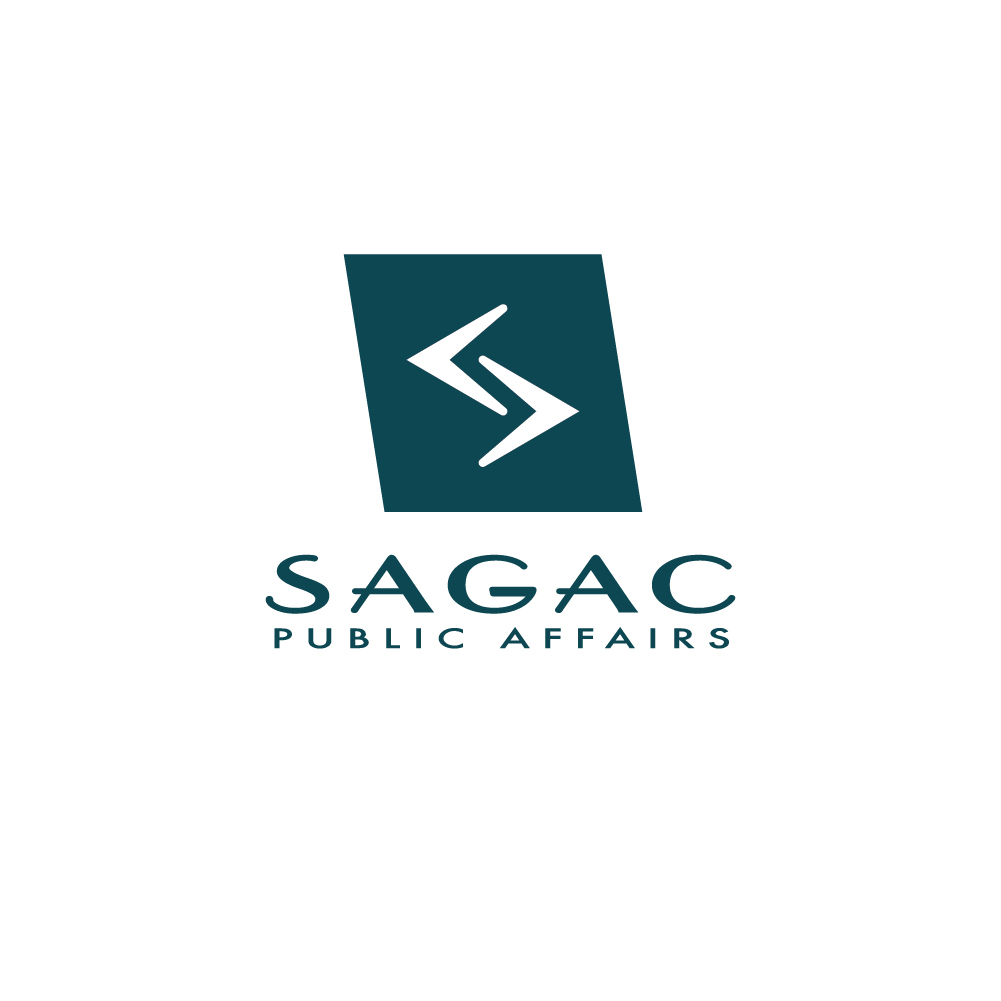
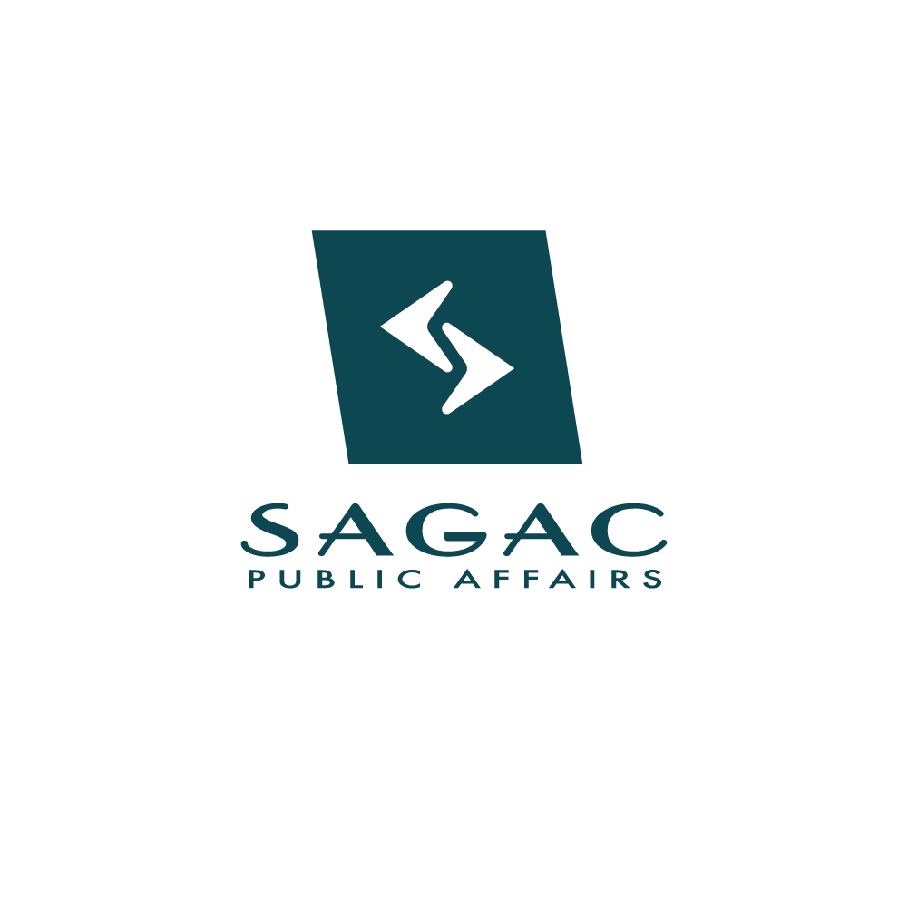
Round 4
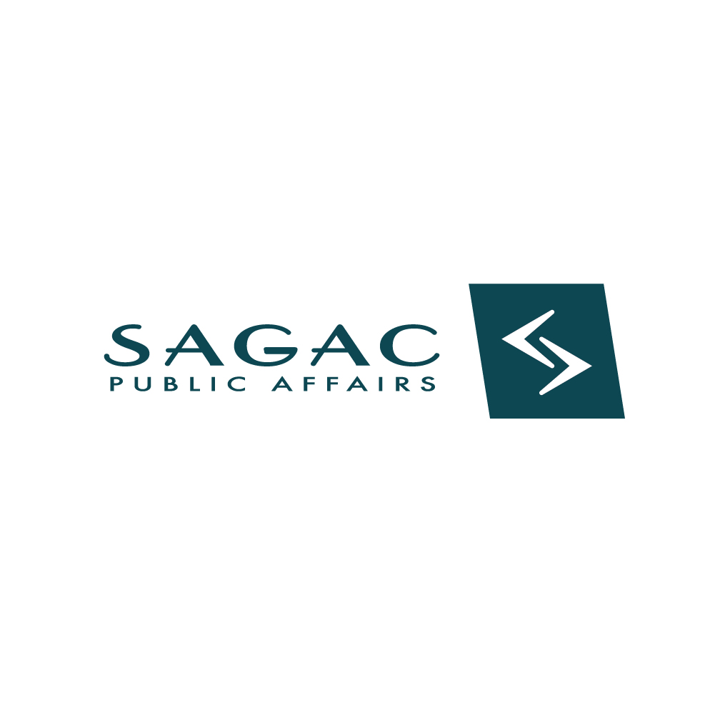
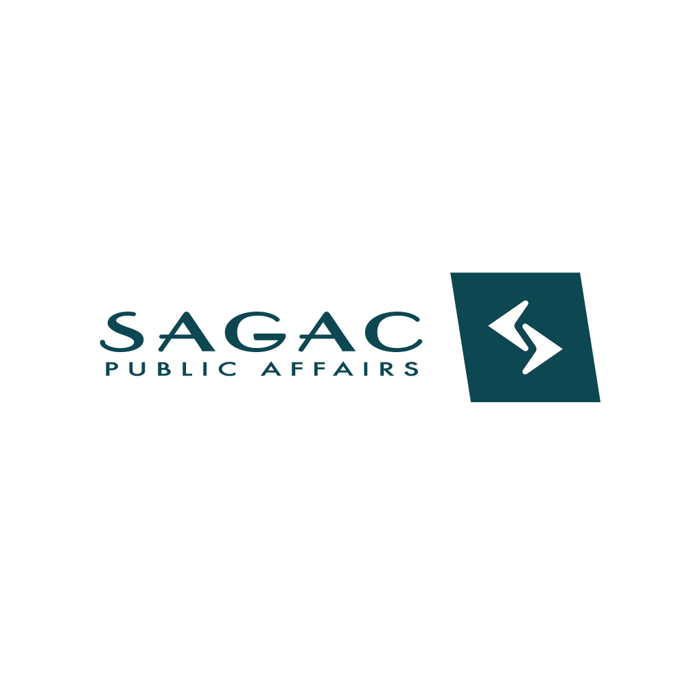
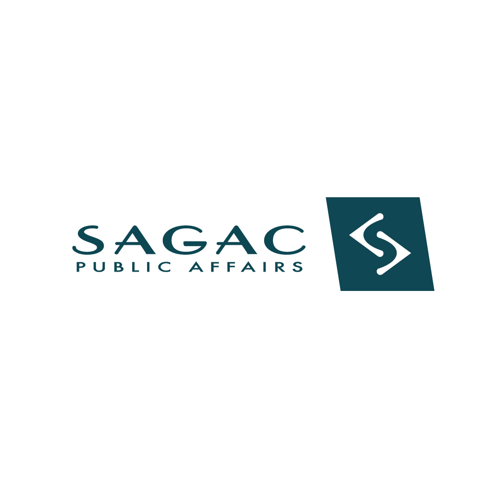
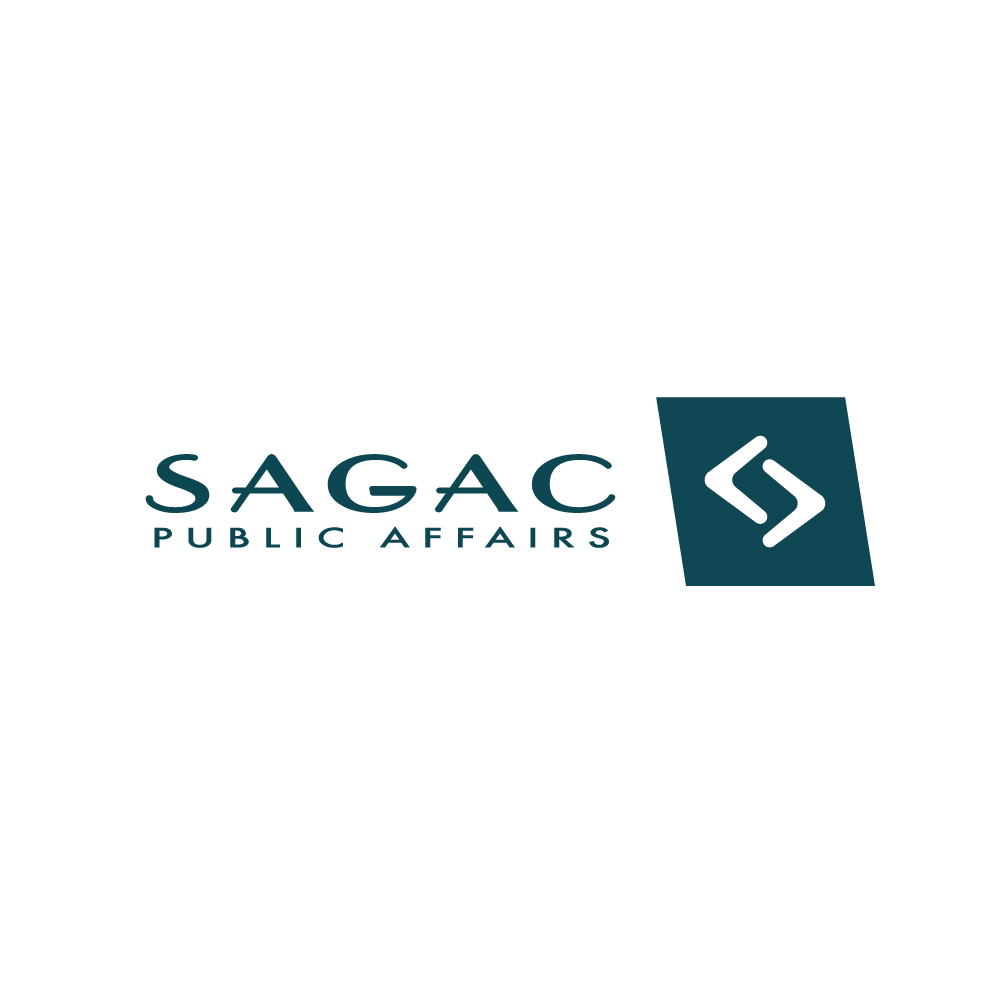
Sagac Logo Refresh Round 4
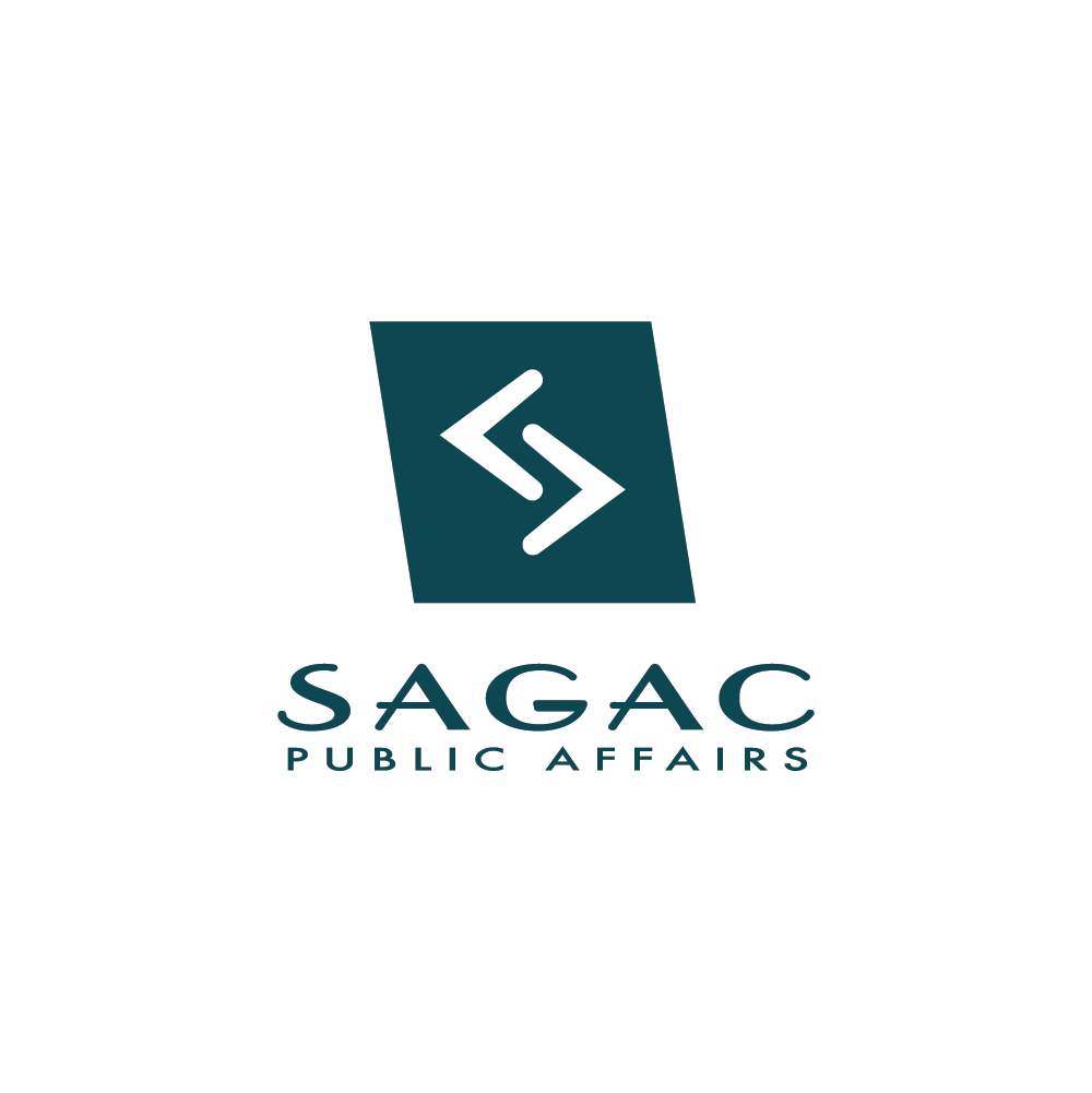
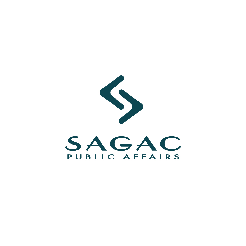
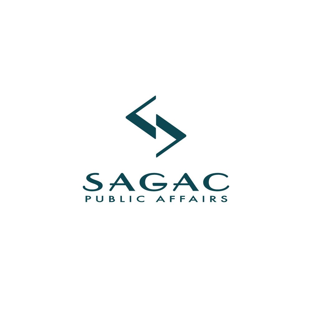
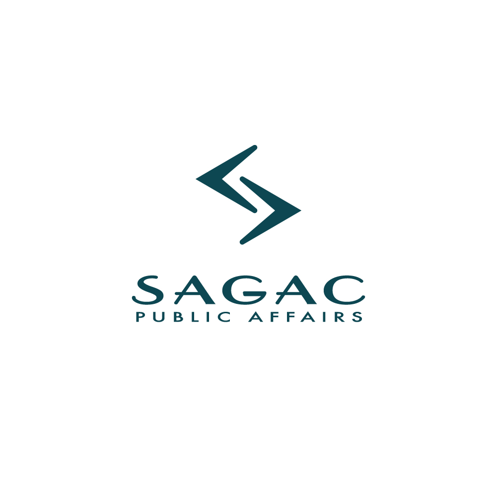
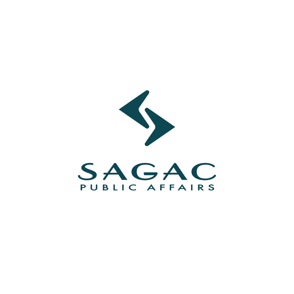
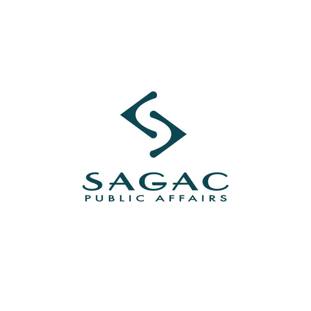
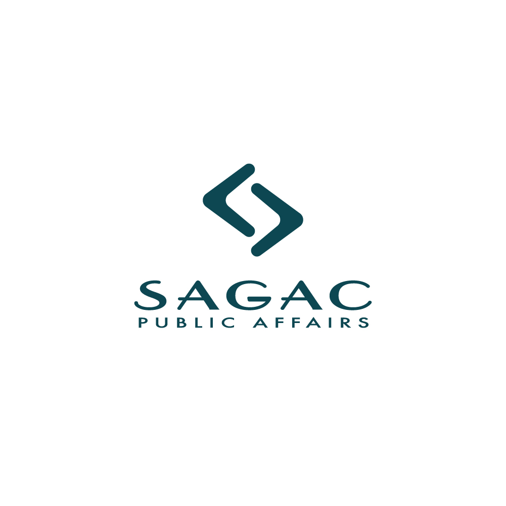
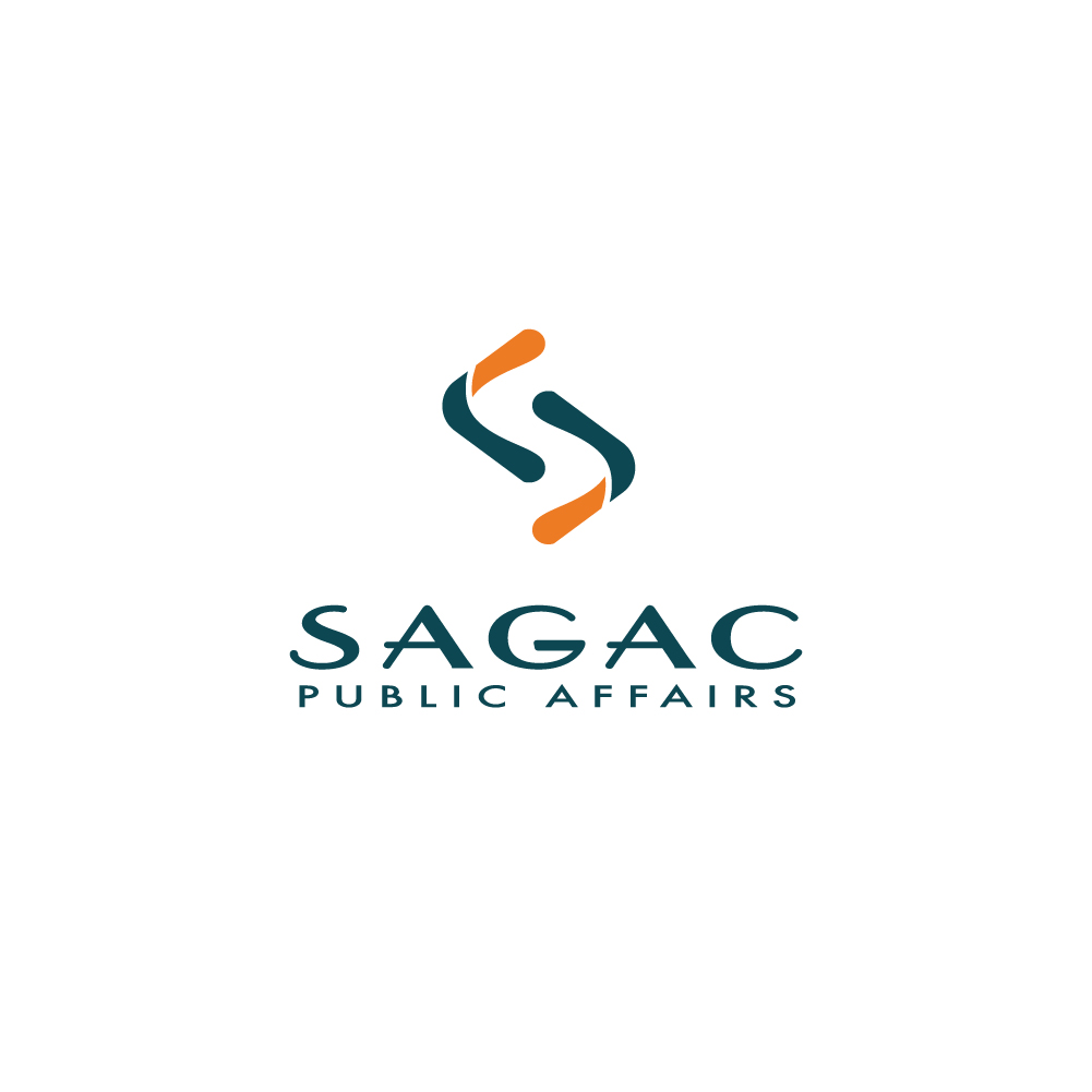
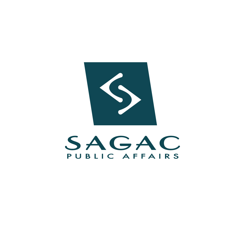
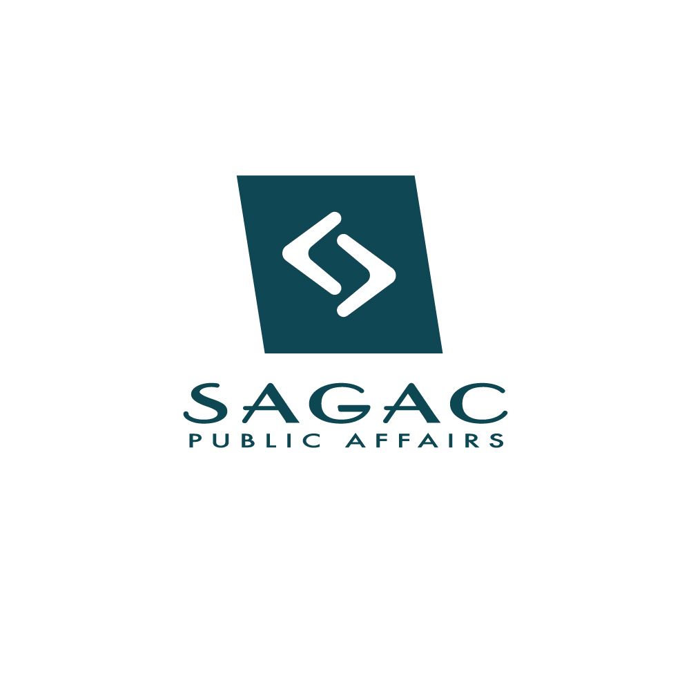
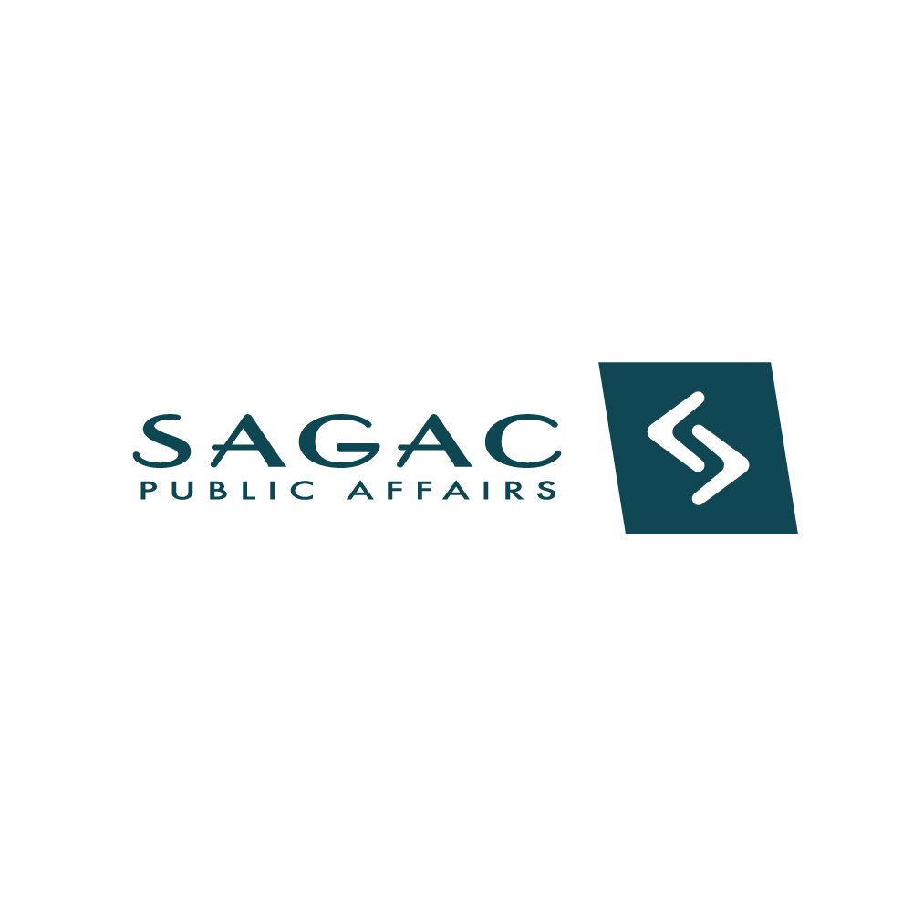
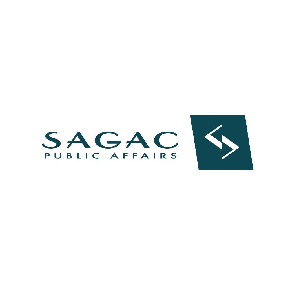
I was asked to try explorations of arrows that had variations on thickness, as well as options that rounded elements. In addition, Jeri sent me a version that she developed that she wanted me to include. I took Jeri’s arrow design that felt very much like frog feet to me, and worked on the curvature. I divided the arrows to give a three-dimensional effect as if the shape was folded over. This maintained the original concept of the arrow, incorporated Jeri’s arrow version, added additional visual interest, and allowed for a two-color version. We presented these new options to the marketing department and then narrowed down to a final 3 options that we would present to the entire company again.
Round 5
Sagac Logo Refresh Round 5
For these final 3 options, I mocked up how they could look in the context of the potential design aesthetic that I had been developing alongside the logo in consultation with Jeri. There was overwhelming support for the final option from the entire company.
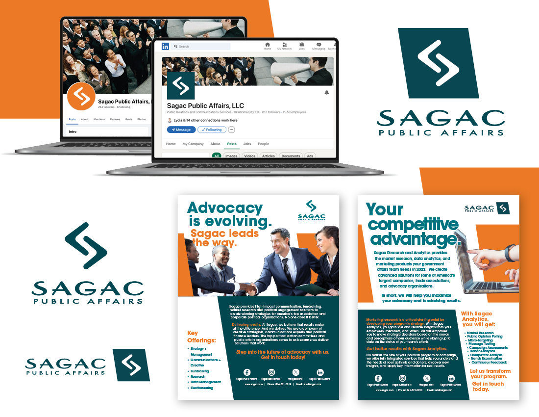
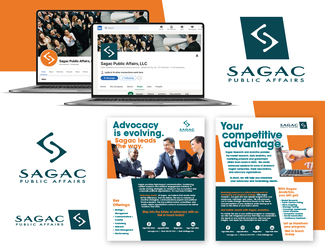
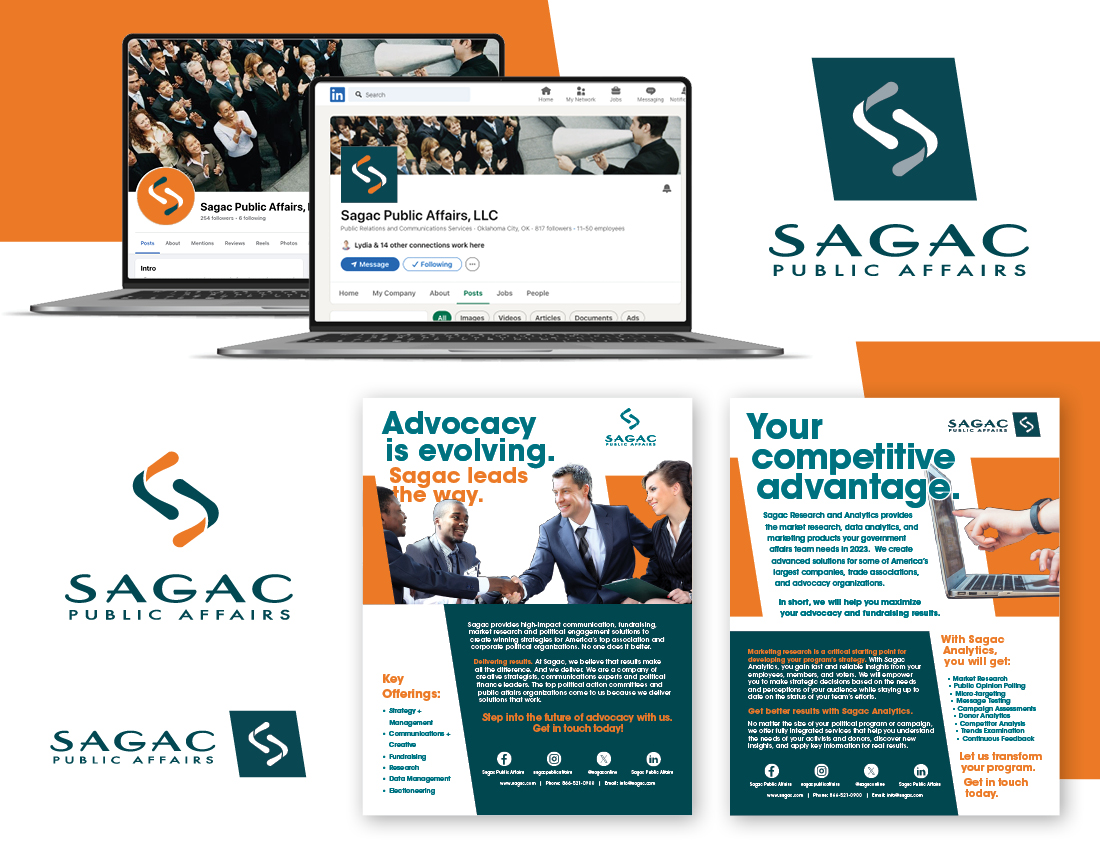
The final system
Sagac Logo Refresh Final
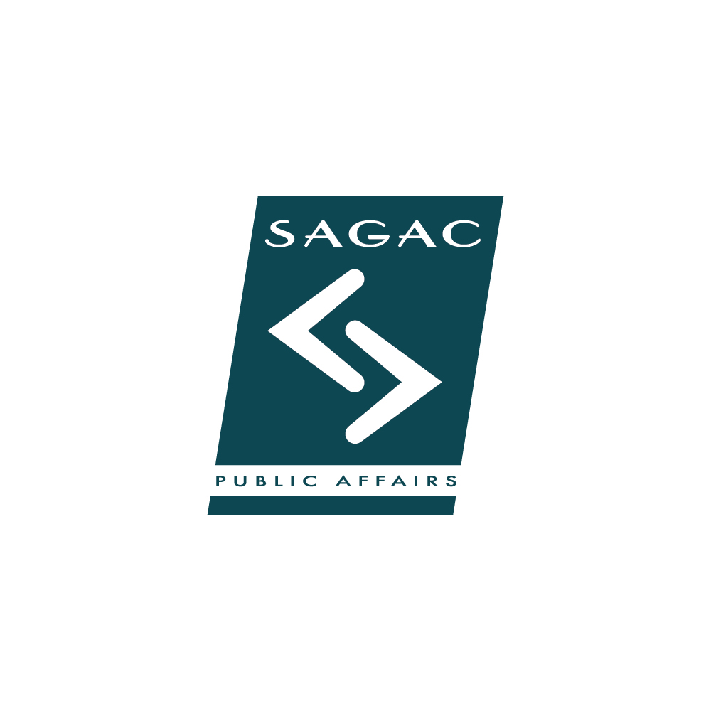
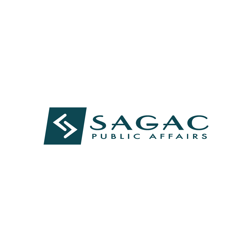
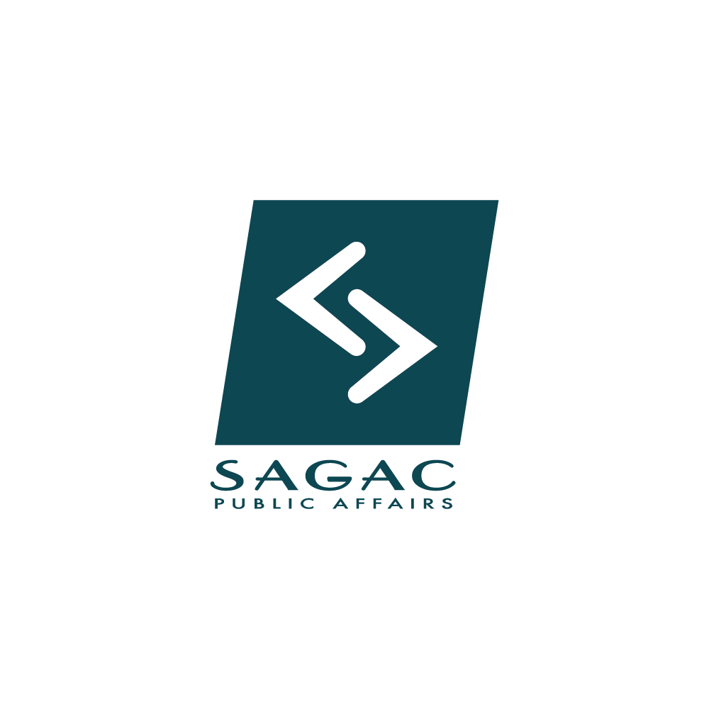
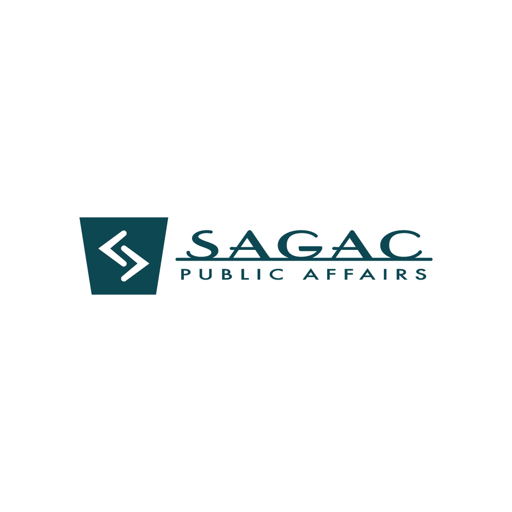
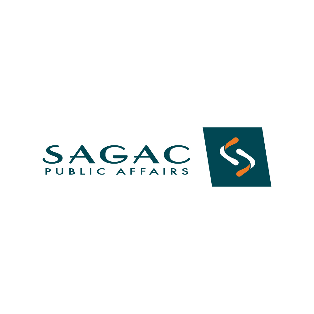
For the final version of the refreshed logo, we developed a primary horizontal and vertical version as well as a secondary horizontal and vertical logo with the arrows in a slanted holding shape and a tertiary icon mark that could stand alone on social media profile pictures and similar settings.

Guidelines
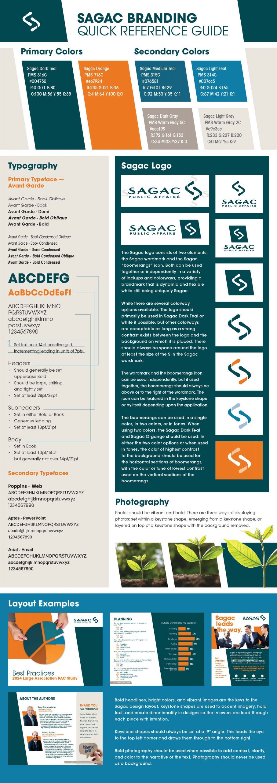
Sagac Branding Quick Reference Guide
Taking the final logo and the design aesthetic I developed alongside it, I fleshed out a branding quick reference guide that explained how to use the logos, design elements, colors, typography, spacing, and photography to ensure that all Sagac materials feel consistent and unified moving forward.
In the wild
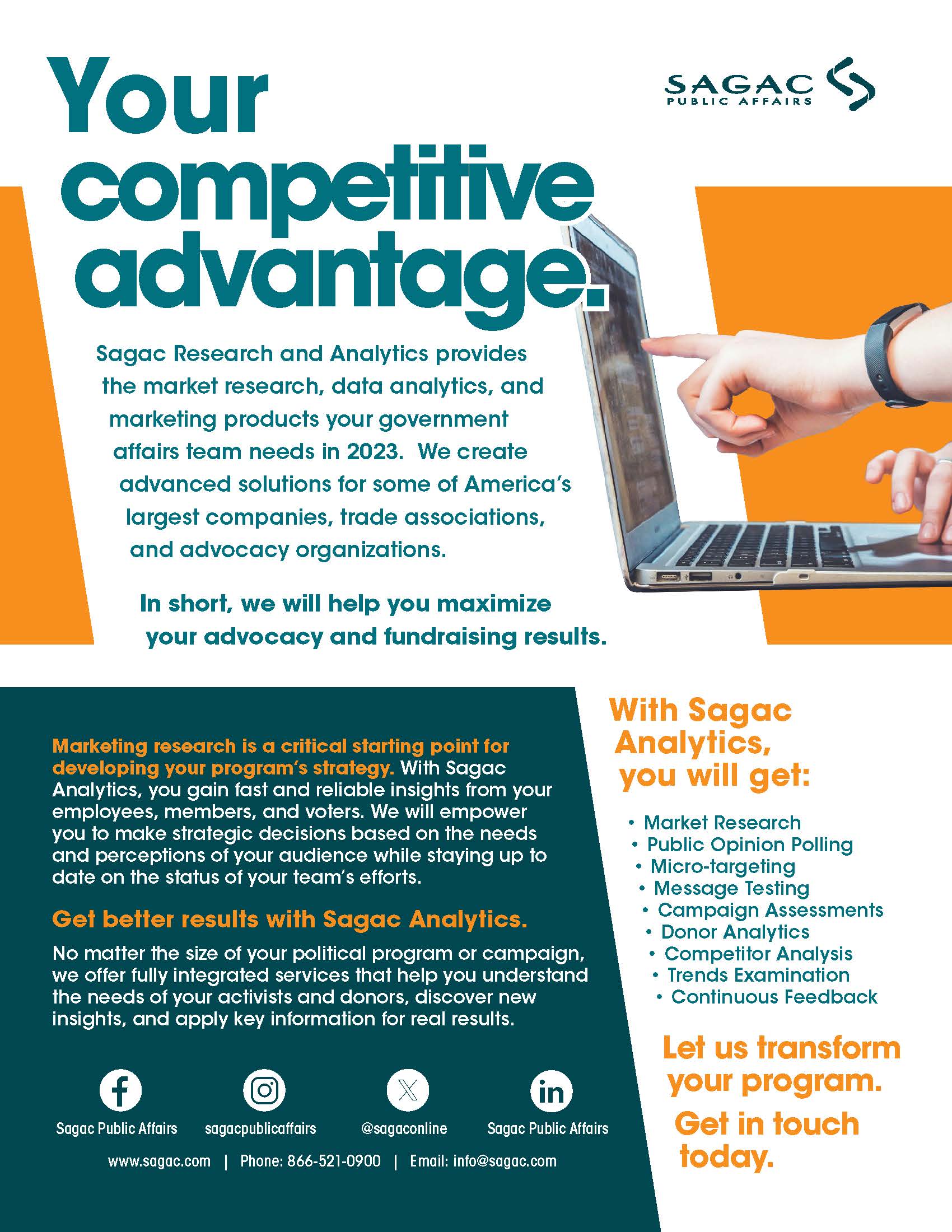
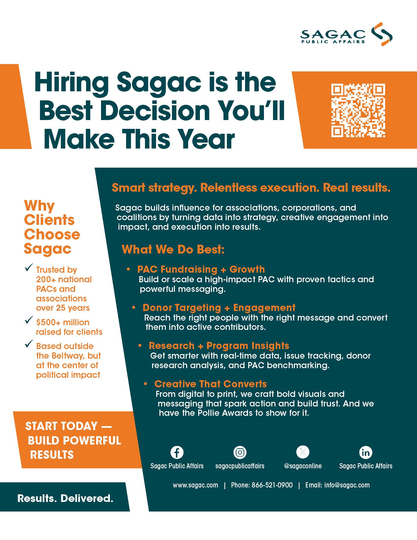
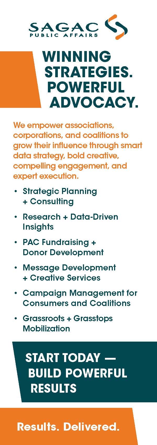
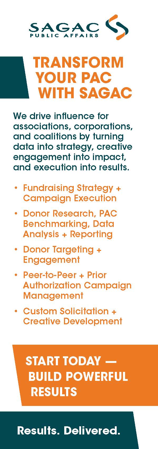
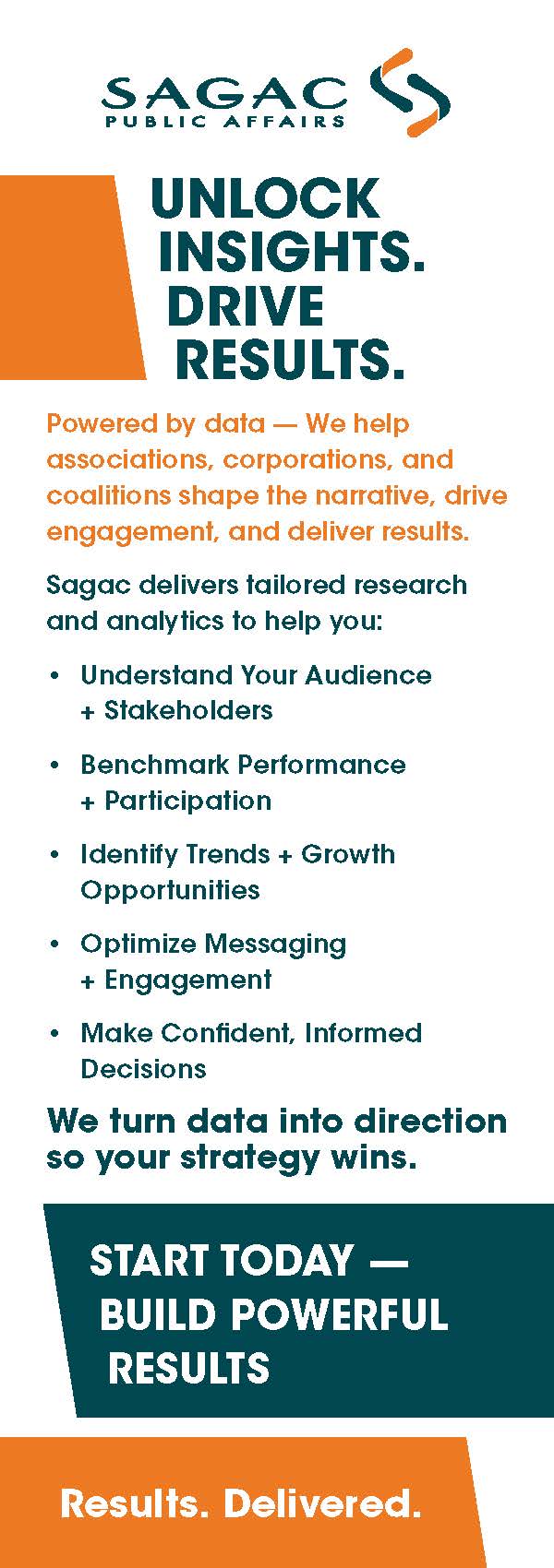
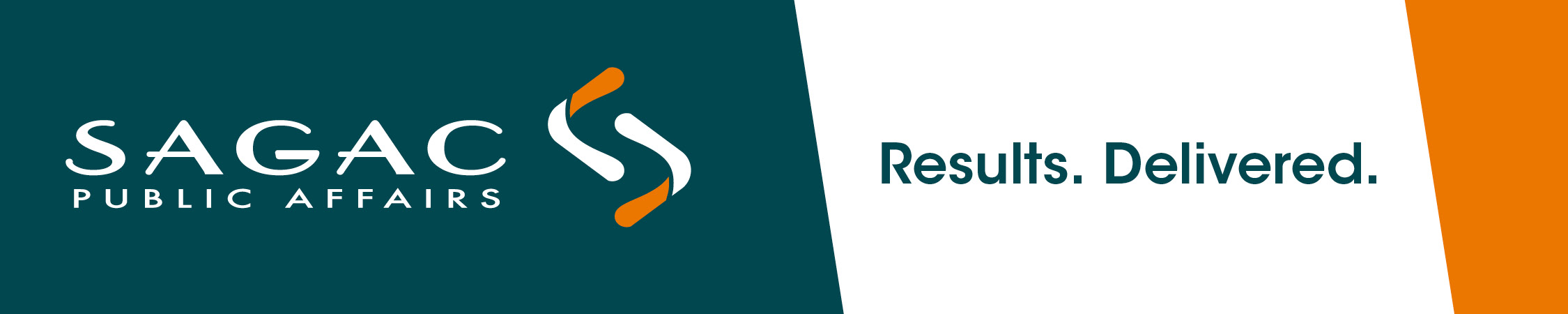
Sagac Public Affairs Updated Collateral Materials
Below are some examples of the brand refresh in action.


Motion
Sagac Public Affairs Motion Design Examples
Transitioning from static design elements into motion design presented me with opportunities to add more character and energy to the brand. I developed these three videos that feature the refreshed Sagac branding along with motion design elements that I incorporated into the company design language.
Hiring for creative leadership?
Let’s build something effective together.
Open to Creative Director, Associate Creative Director, Senior Brand Designer and Senior Graphic Designer roles.