

Case study 06
HealthEquity Polly Campaigns
A study on campaigns I designed for Purple PAC, the political action committee for HealthEquity, utilizing heavily modified stock imagery elements to create a custom yet budget-friendly series of campaigns that the client loved.
At a glance
Overview
-
01
Challenge
Give an existing PAC mascot a more engaging and versatile personality without the time or budget required for fully custom illustration.
-
02
Approach
Adapted an existing illustration into a flexible character system that could support multiple poses, settings, and seasonal campaigns.
-
03
Execution
Created new scenes and poses for Polly and integrated the character into campaign layouts and supporting communications.
-
04
Collaboration
Worked within the client’s budget and timeline while developing a solution that could extend beyond the initial summer campaign.
-
05
Outcome
The client continued using the character across multiple seasonal campaigns, turning a single creative solution into a reusable visual asset.
- Seasonal campaigns: summer, fall, holiday and spring
- 4
- Reusable character system
- 1
Meet Polly
Big personality on a tight budget
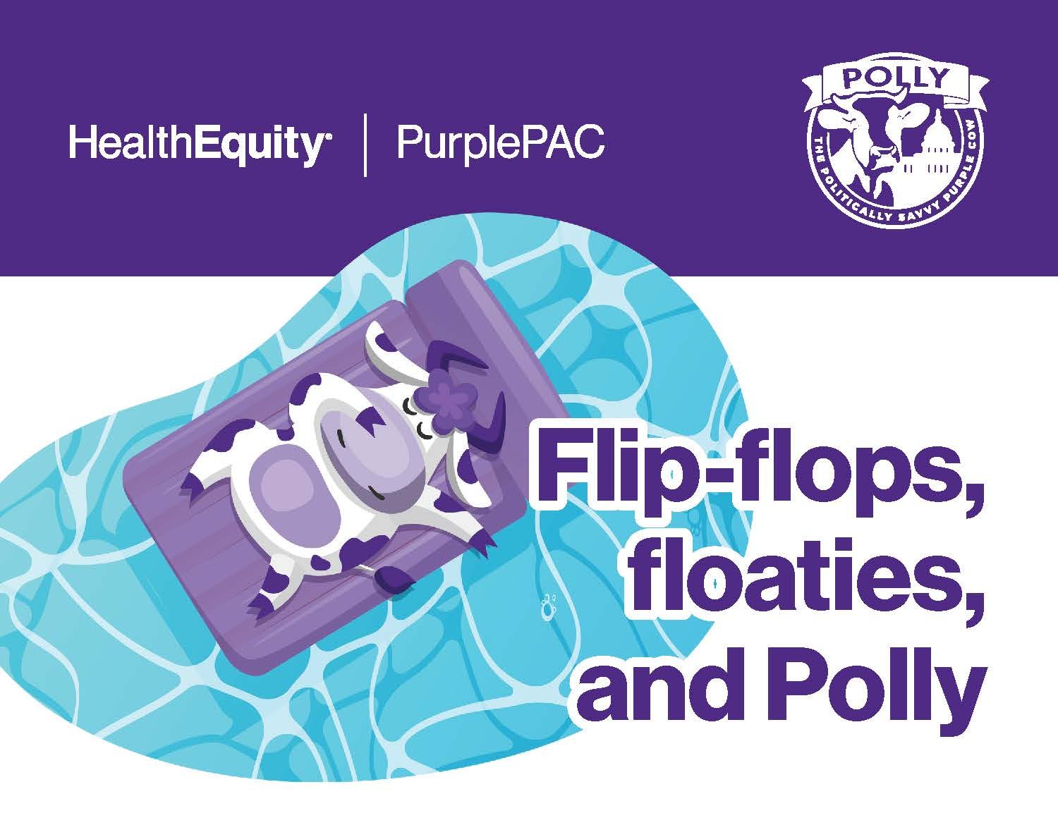
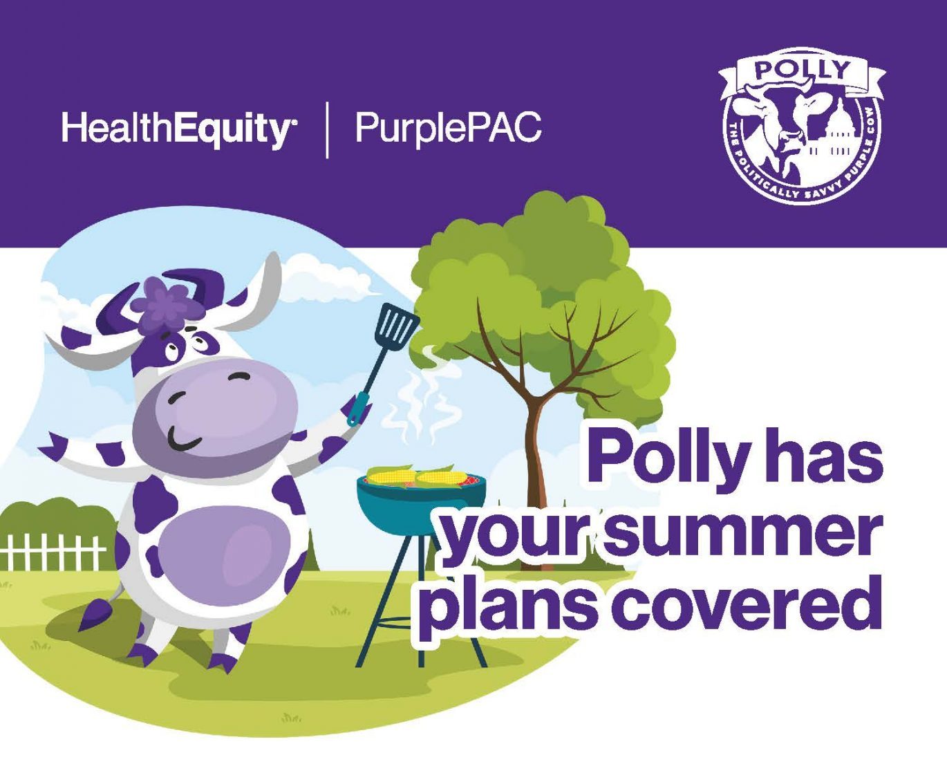
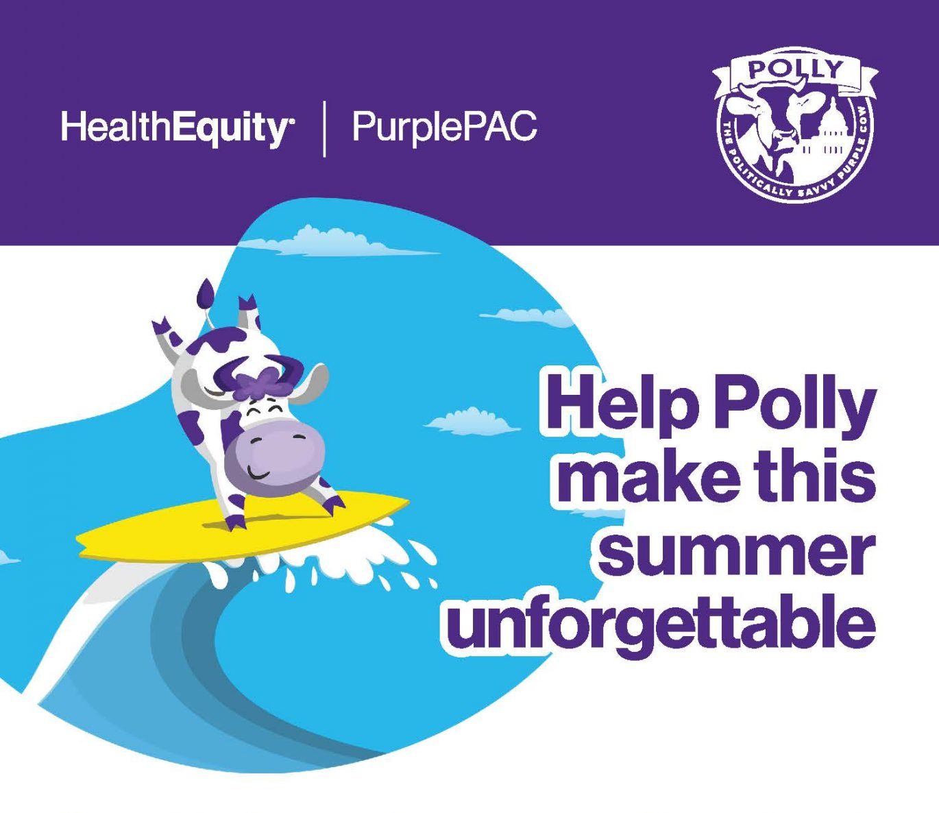
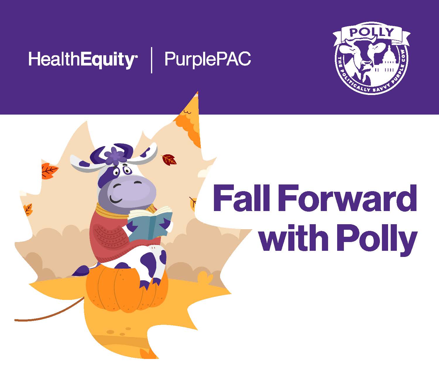
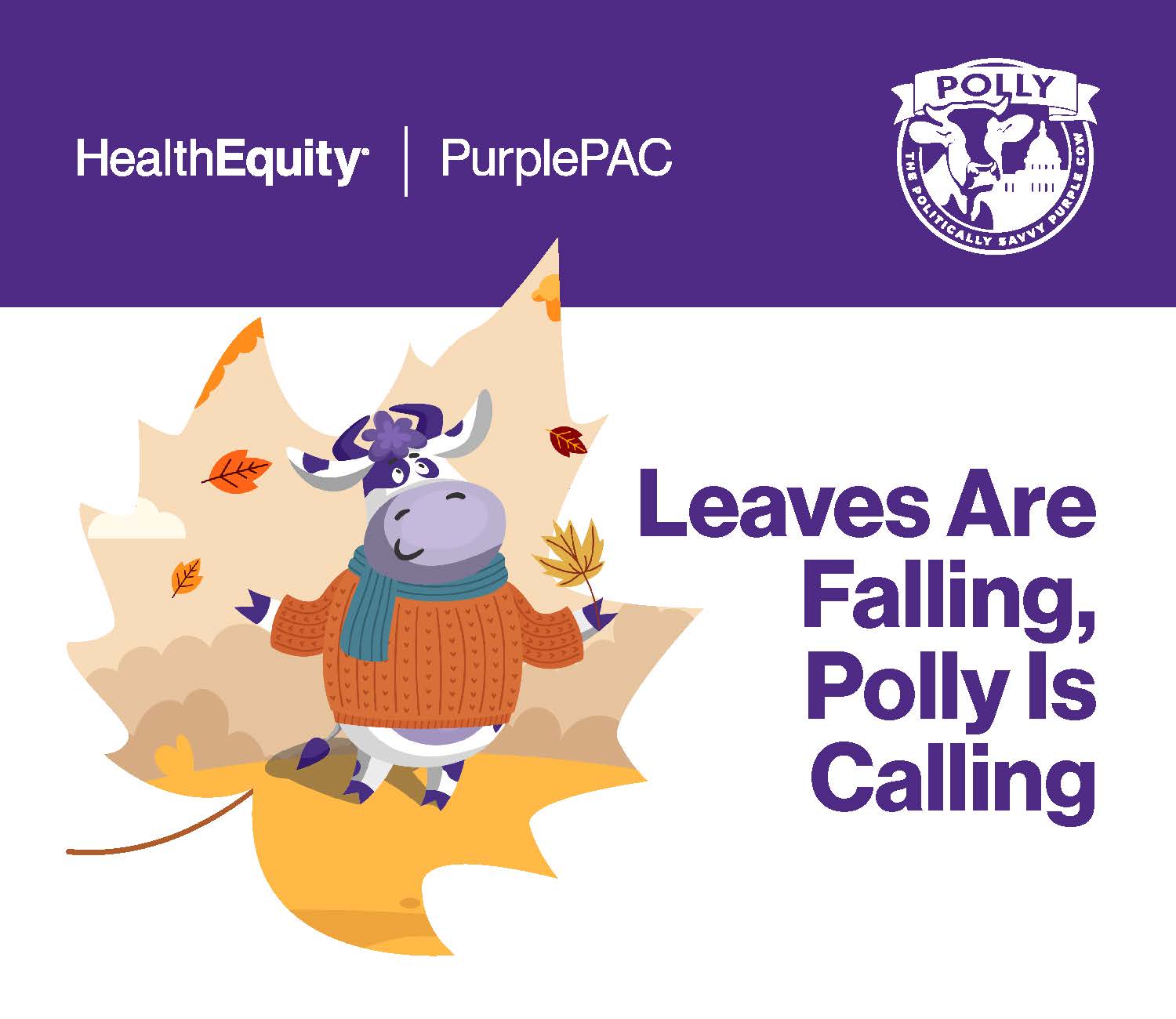
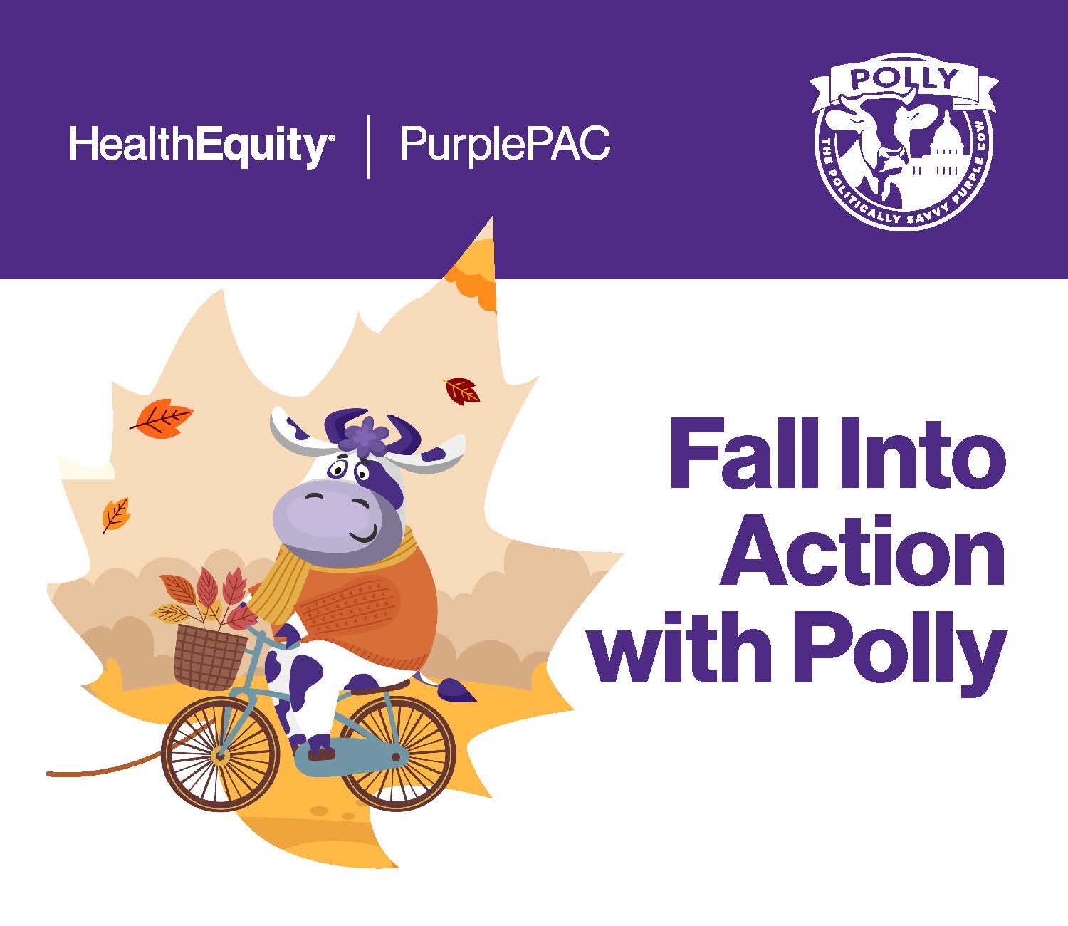
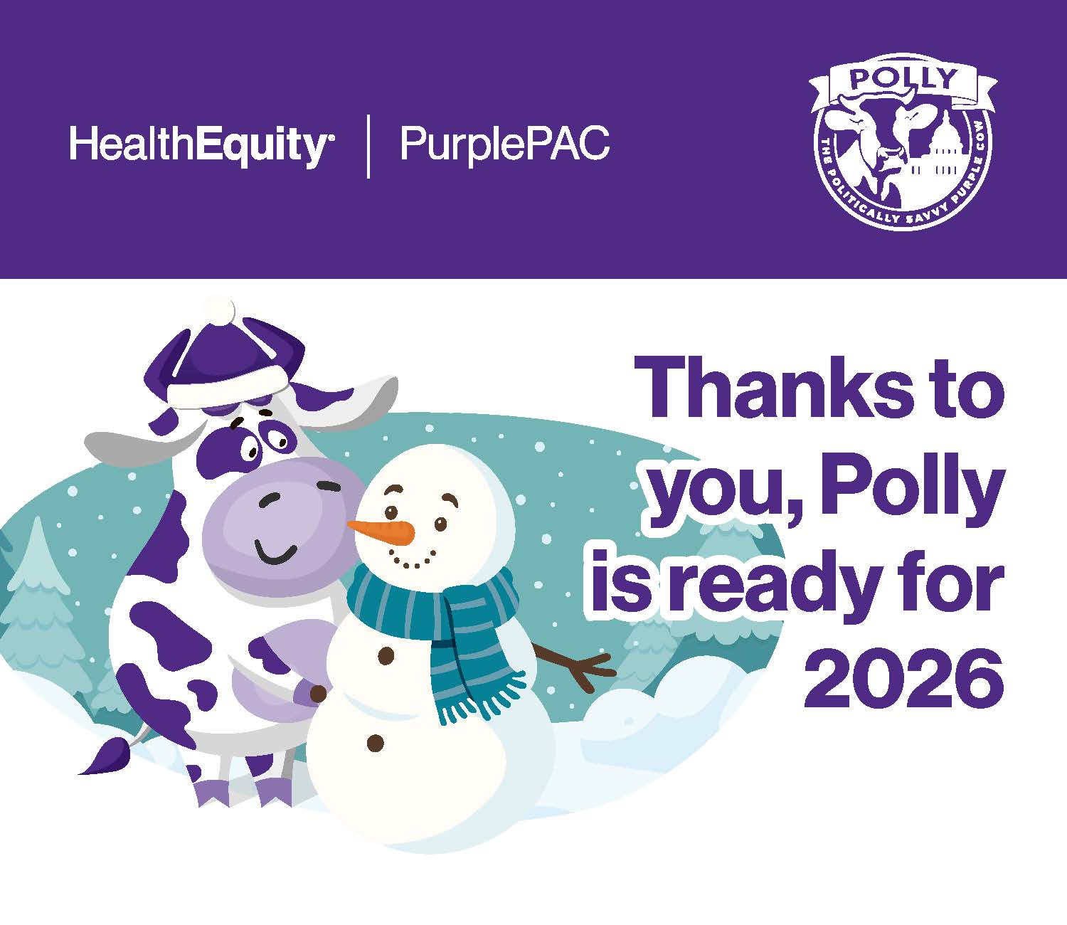
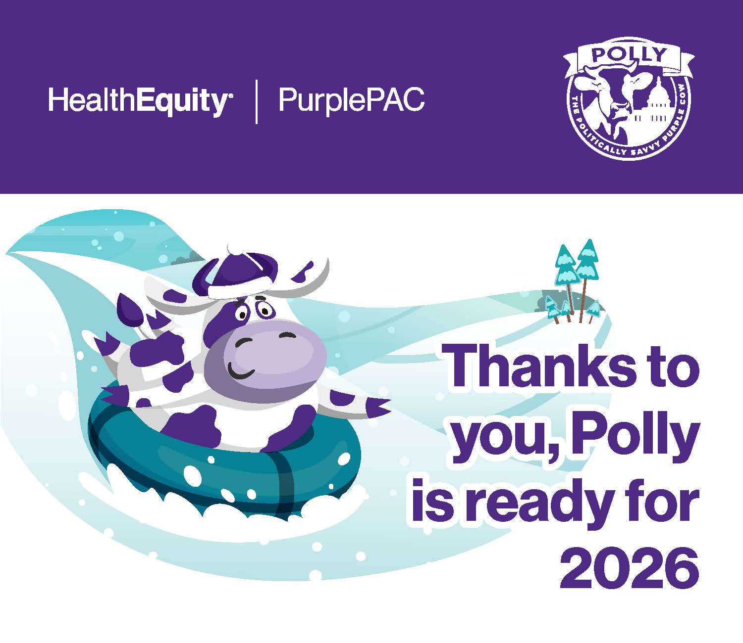
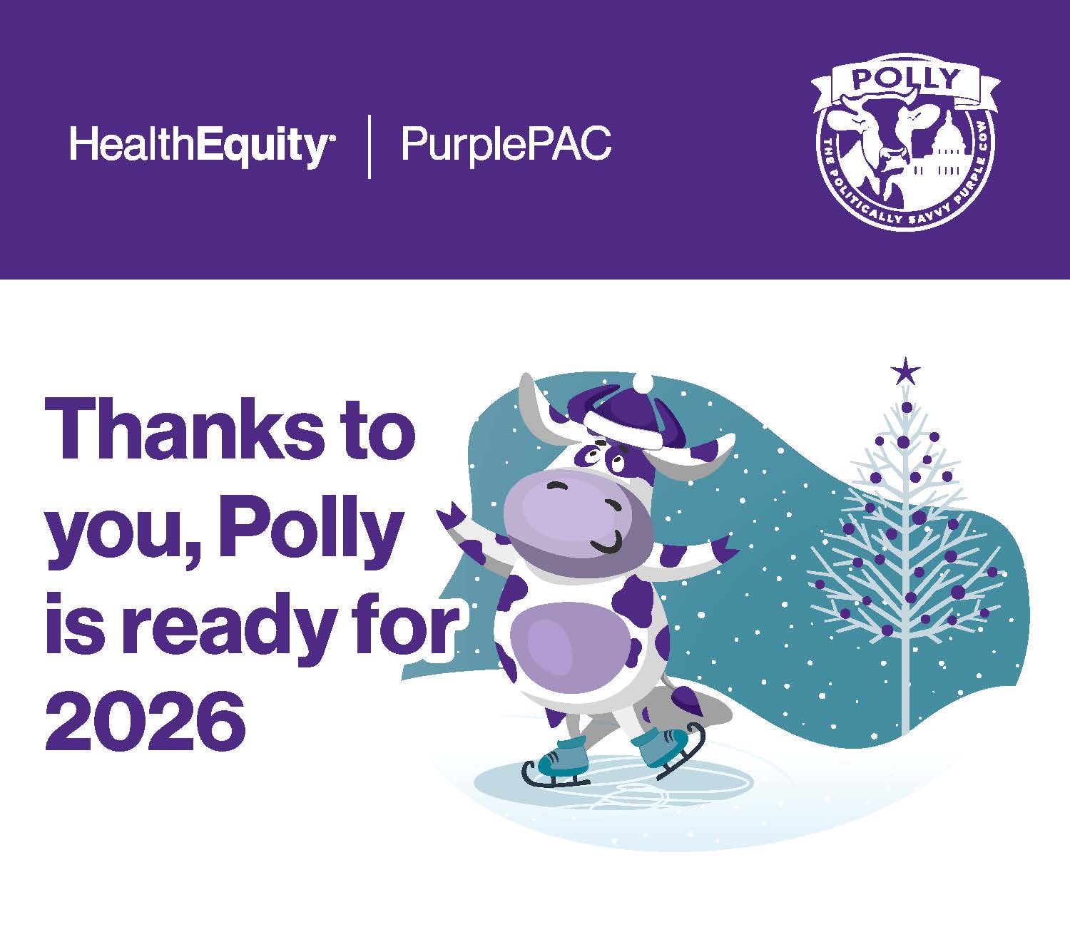
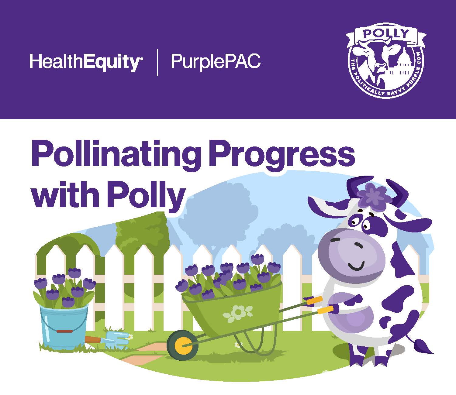
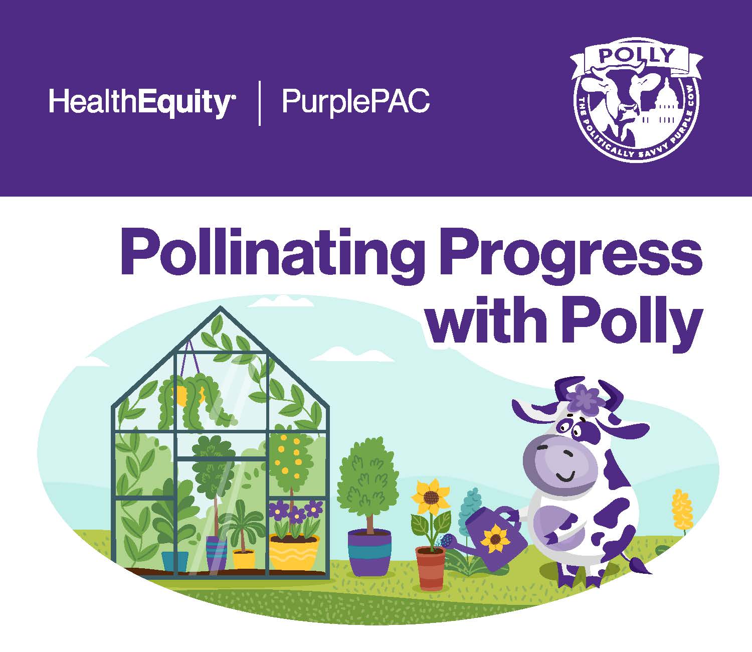
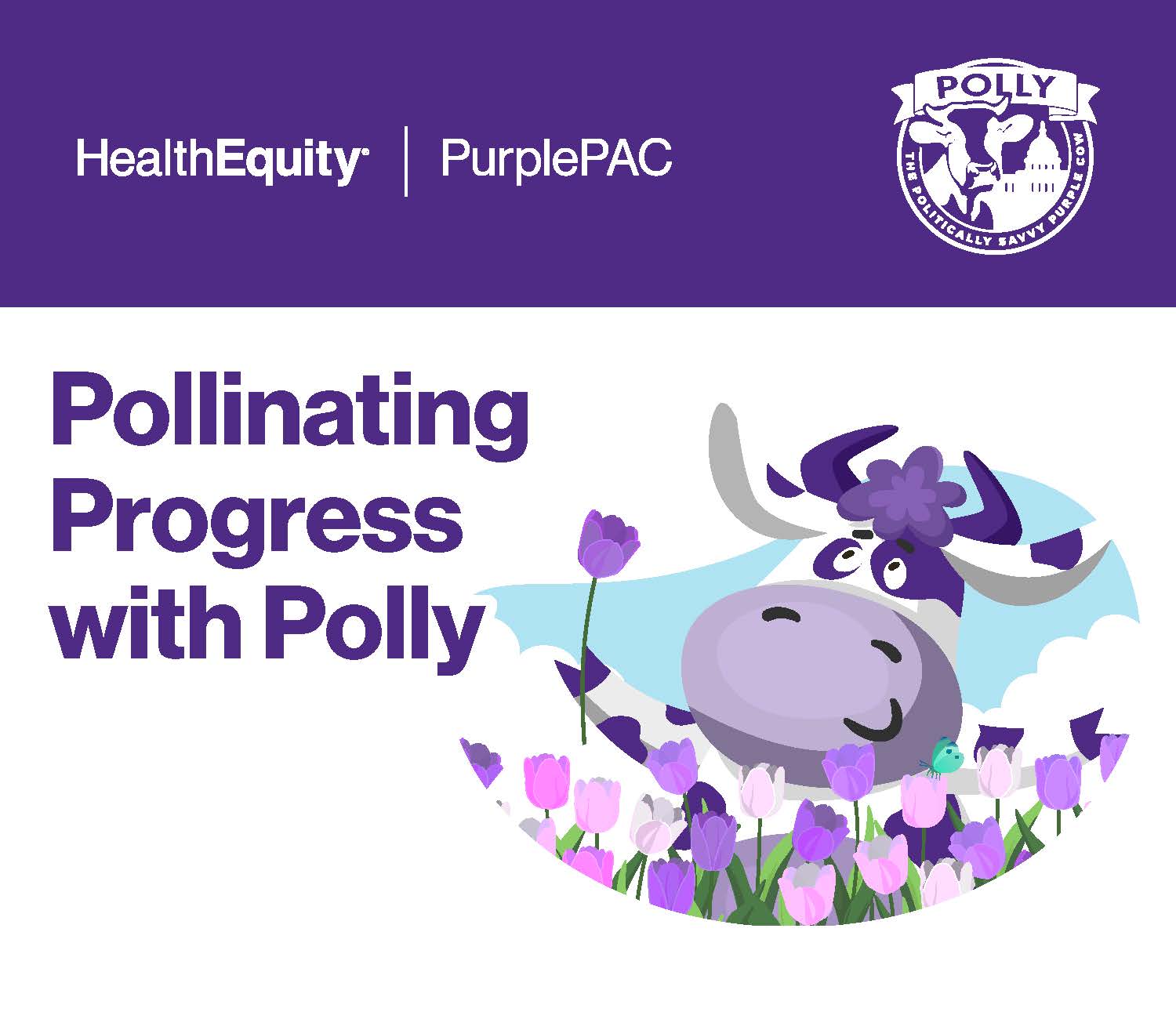
The political action committee for HealthEquity, PurplePAC, had commissioned Sagac to create a mascot for the PAC to serve as an embodiment of the spirit of their efforts. Previous to my arrival, Sagac had produced a purple and white Holstein cow named Polly. They used this mascot in a little shield emblem, but it wasn’t being used to its full potential. I was asked to create a fun, cute version of the cow set in action poses representing summer activities to use for the HealthEquity summer campaign in 2025. I was also tasked with creating something that wasn’t hugely time-consuming, as the client didn’t have the hours available for a truly custom illustration. I was able to find a stock illustration of a cartoon cow in different poses that I was able to adapt to a wide variety of actions and scenes, creating a character that was full of energy, enthusiasm, and fun without spending an inordinate number of hours on the project.
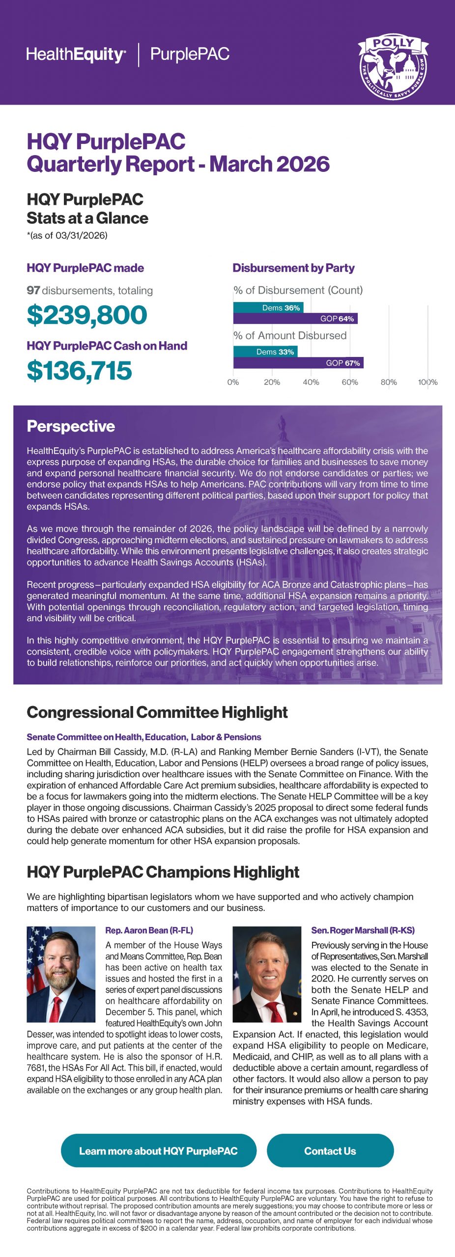
The client loved the summer campaign so much that we went back to this version of Polly for the Fall, holiday season, and Spring campaigns. I have included another piece that I regularly updated for HealthEquity as an example of what their regular communications look like. The Polly images fit in with their overall messaging well, while injecting a bit of life into their communications each quarter.
Ongoing communications
Quarterly reporting with a consistent voice
Hiring for creative leadership?
Let’s build something effective together.
Open to Creative Director, Associate Creative Director, Senior Brand Designer and Senior Graphic Designer roles.