

I began work as the Director of Graphic Design for Good Shepherd Hospice in December of 2018. In this position, I have been responsible for maintaining the brand through all uses throughout the company. This has included all print collateral, ID badges, signage, apparel, promotional products, and digital media, including the company website, marketing campaign videos, phone hold messaging, and digital business cards. When I began, the company had 17 offices in 4 states. Good Shepherd currently has 28 offices, with more on the way.
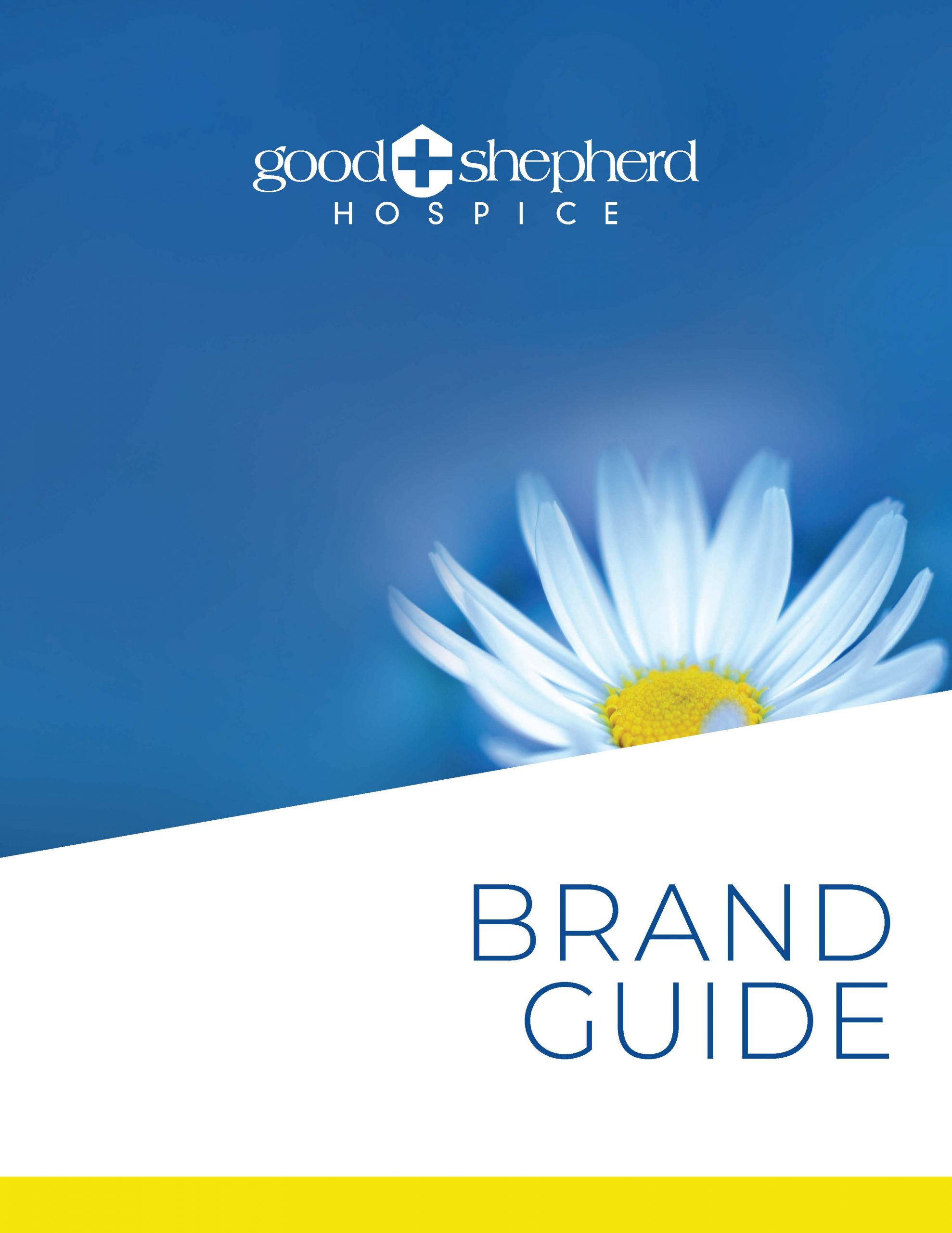
In the course of my work, I have redesigned or overseen the redesign of nearly all of our materials. When I began, our materials were in desperate need of attention. There was no consistency of design from piece to piece. The only elements that stylistically unified the collateral materials were the use of an image of a white daisy, the company logo, the company colors of blue and yellow and the company slogan, “Compassionate about care. Passionate about life.” Even these elements were not used consistently. I began by developing a core design framework that could be used on all public facing marketing collateral utilizing these existing elements. It was important that this framework not stray away too far from the existing brand equity while also elevating the perceived quality of service, creating a consistent style that was recognizable to the brand, and improving the usefulness of these materials as sales tools for our hospice consultants.
Original Collateral
In the process of redesigning these marketing materials, I also worked to streamline the process of how these materials were produced and updated. The existing designs had been laid out in Photoshop and Illustrator making them difficult to update efficiently, with little standardization of the text layout or typefaces used. I rebuilt all of our collateral in InDesign. All materials have a standard 12 pt font for body text with a leading of 14pts. All leading in documents is based on units of 7, with everything sitting on a baseline grid. Two type families are used, Montserrat and Barlow Condensed, both Google fonts that don’t require expensive licensing for use. These two fonts work well together and produce dynamic textures and rhythms in layouts. Creating this framework for the design of Good Shepherd’s materials enables an expectation for the audience of what a Good Shepherd document will look like, creating stability within the brand.
In addition to these style standards, I utilized the data merge function within InDesign to allow for materials to be quickly updated for all of our locations without having to manually adjust layer after layer as had been done previously with the documents that my predecessors had developed in Illustrator and Photoshop. I created spreadsheets for a variety of company information to allow for materials to quickly be produced with site specific information.
Updated Collateral
Along with these public facing materials, I have been working my way through all of Good Shepherd’s internal documents, forms, booklets, and manuals to bring standardization, improved readability, and ease of use to these materials as well. Most of the company’s existing forms had been designed in Microsoft Word with inconsistent styles and with varying degrees of usefulness. Adding to this, most of the forms were being distributed as copies of copies, with terrible degradation in quality. I developed a standard layout for all Good Shepherd internal forms. I have worked to make all of these forms fillable pdfs, with only a few left to be redeveloped. I updated booklets and training manuals using the styling standards I developed, improving readability by creating a consistent flow for the eyes to follow. All of these materials are available for digital distribution.
Updated Forms
The company’s previous website was lost due to the fault of a hosting company that was contracted before my arrival during a server migration. The company was left without a website and without any way to recover the previous version. I rebuilt the Good Shepherd website from the ground up. In developing the website, I used the opportunity to introduce elements that I would carry forward into a new design aesthetic across materials throughout the company. I introduced the use of diagonal lines that add dynamic energy that draw the eye through the site. I brought in more white space to allow the information to breathe. I carried this new design aesthetic into our collateral materials, first with our business cards and then into the marketing collateral as pieces needed to be updated.
Current Collateral
Along with this new design aesthetic, I developed a refreshed logo for Good Shepherd. This logo utilized a bold, sans serif font, replacing a dated, wide, thin weight serif font. The shield was updated to better reflect the intent of the original design: a roofline, representing the home based nature of hospice care; a cross, reinforcing the idea of the Christian message of the good shepherd; and the letter G. My new iteration of the original concept corrected several of the original crest’s weaknesses. It removes the awkward remnant of the original G crossbar extending out of the main crest shape. By shifting from a solid crest with the cross in the white space, to a crest made with a thick lineweight, it removes the weak connection uniting the top of the crest with the bottom of the crest caused by the cross counterspace. This weakness created unwanted tension in the crest, leaving it feeling unintentionally fragile. It also makes the roofline feel less shoehorned into the design. This new logo would work well with the fresh design aesthetic I was implementing, presenting a concept that felt welcoming, warm and airy, while feeling more modern and professional. I presented this potential new logo to leadership for evaluation, but they decided against moving forward with it.
As workload grew, I was able to expand the graphic design department, adding a new graphic designer to Good Shepherd. With this additional help, we were able to expand a monthly marketing program that I had inherited when I arrived. Each month I would design a pen with an accompanying poster featuring a new theme. I had wanted to expand this program to include a video that would be shared through social media posts and email marketing. Time restraints prevented me from fully developing this. With the addition of another designer, I was able to implement this program. She and I took turns developing a design each month that was featured on a pen, in social media posts, and in a short informational video. These campaigns have given us ways to break away from the same yellow and blue design aesthetic to explore new and interesting design ideas that don’t necessarily fit with the main brand, but don’t take away any brand equity. I have included a brief highlight reel here, but to learn more about these campaigns, look here.
Monthly Campaigns
During my time with Good Shepherd, I have been able to implement companywide design policies and procedures. I proposed and implemented a ticketing system for both the graphic design department and the IT department, managing the system for both departments. I worked with developers that had been hired before my arrival to implement a company intranet. They were unable to develop a system that met our needs. Their system required me to develop and maintain a database of all company employees, as one did not exist, in order to create login credentials for our staff. Their system wouldn’t allow for batch uploads of files for the file management system. Their calendar functions were difficult for the staff to use. I was able to lead them in making several UX improvements, but it wasn’t enough to overcome the deficiencies of their system. I recommended that we move on from this developer and evaluate other options. After evaluating costs and benefits of different platforms, I recommended the implementation of Microsoft Sharepoint as our file management and intranet platform, along with upgrading our computer systems to Office 365 from Office 2007. Initial discussions with management have been positive, but final decisions have yet to be made. I have always looked for ways to improve productivity, save money, and bring value to not only the graphic design department but for Good Shepherd Hospice as a whole.
I began work as the Director of Graphic Design for Good Shepherd Hospice in December of 2018. In this position, I have been responsible for maintaining the brand through all uses throughout the company. This has included all print collateral, ID badges, signage, apparel, promotional products, and digital media, including the company website, marketing campaign videos, phone hold messaging, and digital business cards. When I began, the company had 17 offices in 4 states. Good Shepherd currently has 28 offices, with more on the way.
In the course of my work, I have redesigned or overseen the redesign of nearly all of our materials. When I began, our materials were in desperate need of attention. There was no consistency of design from piece to piece. The only elements that stylistically unified the collateral materials were the use of an image of a white daisy, the company logo, the company colors of blue and yellow and the company slogan, “Compassionate about care. Passionate about life.” Even these elements were not used consistently. I began by developing a core design framework that could be used on all public facing marketing collateral utilizing these existing elements. It was important that this framework not stray away too far from the existing brand equity while also elevating the perceived quality of service, creating a consistent style that was recognizable to the brand, and improving the usefulness of these materials as sales tools for our hospice consultants.
Original Collateral
In the process of redesigning these marketing materials, I also worked to streamline the process of how these materials were produced and updated. The existing designs had been laid out in Photoshop and Illustrator making them difficult to update efficiently, with little standardization of the text layout or typefaces used. I rebuilt all of our collateral in InDesign. All materials have a standard 12 pt font for body text with a leading of 14pts. All leading in documents is based on units of 7, with everything sitting on a baseline grid. Two type families are used, Montserrat and Barlow Condensed, both Google fonts that don’t require expensive licensing for use. These two fonts work well together and produce dynamic textures and rhythms in layouts. Creating this framework for the design of Good Shepherd’s materials enables an expectation for the audience of what a Good Shepherd document will look like, creating stability within the brand.
In addition to these style standards, I utilized the data merge function within InDesign to allow for materials to be quickly updated for all of our locations without having to manually adjust layer after layer as had been done previously with the documents that my predecessors had developed in Illustrator and Photoshop. I created spreadsheets for a variety of company information to allow for materials to quickly be produced with site specific information.
Updated Collateral
Along with these public facing materials, I have been working my way through all of Good Shepherd’s internal documents, forms, booklets, and manuals to bring standardization, improved readability, and ease of use to these materials as well. Most of the company’s existing forms had been designed in Microsoft Word with inconsistent styles and with varying degrees of usefulness. Adding to this, most of the forms were being distributed as copies of copies, with terrible degradation in quality. I developed a standard layout for all Good Shepherd internal forms. I have worked to make all of these forms fillable pdfs, with only a few left to be redeveloped. I updated booklets and training manuals using the styling standards I developed, improving readability by creating a consistent flow for the eyes to follow. All of these materials are available for digital distribution.
Updated Forms
The company’s previous website was lost due to the fault of a hosting company that was contracted before my arrival during a server migration. The company was left without a website and without any way to recover the previous version. I rebuilt the Good Shepherd website from the ground up. In developing the website, I used the opportunity to introduce elements that I would carry forward into a new design aesthetic across materials throughout the company. I introduced the use of diagonal lines that add dynamic energy that draw the eye through the site. I brought in more white space to allow the information to breathe. I carried this new design aesthetic into our collateral materials, first with our business cards and then into the marketing collateral as pieces needed to be updated.
Current Collateral
Along with this new design aesthetic, I developed a refreshed logo for Good Shepherd. This logo utilized a bold, sans serif font, replacing a dated, wide, thin weight serif font. The shield was updated to better reflect the intent of the original design: a roofline, representing the home based nature of hospice care; a cross, reinforcing the idea of the Christian message of the good shepherd; and the letter G. My new iteration of the original concept corrected several of the original crest’s weaknesses. It removes the awkward remnant of the original G crossbar extending out of the main crest shape. By shifting from a solid crest with the cross in the white space, to a crest made with a thick lineweight, it removes the weak connection uniting the top of the crest with the bottom of the crest caused by the cross counterspace. This weakness created unwanted tension in the crest, leaving it feeling unintentionally fragile. It also makes the roofline feel less shoehorned into the design. This new logo would work well with the fresh design aesthetic I was implementing, presenting a concept that felt welcoming, warm and airy, while feeling more modern and professional. I presented this potential new logo to leadership for evaluation, but they decided against moving forward with it.
As workload grew, I was able to expand the graphic design department, adding a new graphic designer to Good Shepherd. With this additional help, we were able to expand a monthly marketing program that I had inherited when I arrived. Each month I would design a pen with an accompanying poster featuring a new theme. I had wanted to expand this program to include a video that would be shared through social media posts and email marketing. Time restraints prevented me from fully developing this. With the addition of another designer, I was able to implement this program. She and I took turns developing a design each month that was featured on a pen, in social media posts, and in a short informational video. These campaigns have given us ways to break away from the same yellow and blue design aesthetic to explore new and interesting design ideas that don’t necessarily fit with the main brand, but don’t take away any brand equity. I have included a brief highlight reel here, but to learn more about these campaigns, look here.
Monthly Campaigns
During my time with Good Shepherd, I have been able to implement companywide design policies and procedures. I proposed and implemented a ticketing system for both the graphic design department and the IT department, managing the system for both departments. I worked with developers that had been hired before my arrival to implement a company intranet. They were unable to develop a system that met our needs. Their system required me to develop and maintain a database of all company employees, as one did not exist, in order to create login credentials for our staff. Their system wouldn’t allow for batch uploads of files for the file management system. Their calendar functions were difficult for the staff to use. I was able to lead them in making several UX improvements, but it wasn’t enough to overcome the deficiencies of their system. I recommended that we move on from this developer and evaluate other options. After evaluating costs and benefits of different platforms, I recommended the implementation of Microsoft Sharepoint as our file management and intranet platform, along with upgrading our computer systems to Office 365 from Office 2007. Initial discussions with management have been positive, but final decisions have yet to be made. I have always looked for ways to improve productivity, save money, and bring value to not only the graphic design department but for Good Shepherd Hospice as a whole.