Creative Countess - Branding
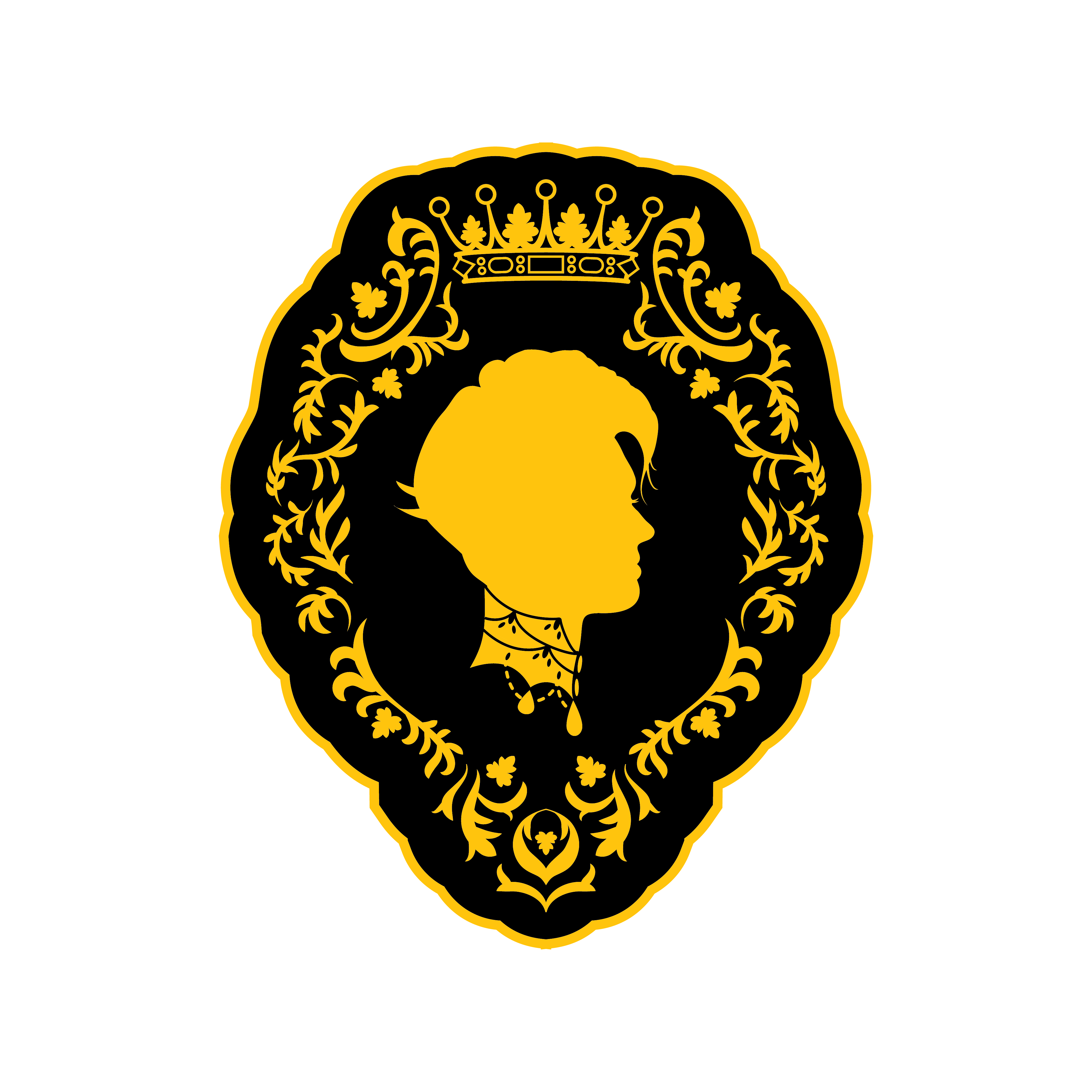
Ashlyn requested the use of black and gold as the colors of the brand. I centered the design around her silhouette. Victorian cameos feature a silhouette framed by golden filigree. I utilized this high gothic style to capture the nobility of a countess. The frame around the silhouette is capped by the coronet of a countess, featuring different elements of various european coronets representing this title. The filigree has elements that reference the antlers of a deer. These antlers are prominently featured on a tattoo of Ashlyn’s. The Victorian jeweled collar adds to the sophistication of the design, giving a hint toward the gothic romance and elegance of vampyric beauty. I gave Ashlyn a very modern and edgy hairstyle, juxtaposing the more stately Victorian elements with a sense of creativity and artistry.
This same juxtaposition can be seen in the typography that I selected. The free and flowing typeface of Buffet Script has an air of vintage glamor and artistic freedom. The more stately Didot confirms the sophistication of a countess with its high contrast, while bringing the design into modernity. As Ashlyn creates a variety of looks through her makeup, special effects, and body painting, I felt it was important to offer a variety of marks, all unified in design, but each with its own character. That is why there are 5 variations on the logo, each of which can be used interchangeably and still be instantly recognizable as belonging to Creative Countess.


Creative Countess - Branding

Ashlyn requested the use of black and gold as the colors of the brand. I centered the design around her silhouette. Victorian cameos feature a silhouette framed by golden filigree. I utilized this high gothic style to capture the nobility of a countess. The frame around the silhouette is capped by the coronet of a countess, featuring different elements of various european coronets representing this title. The filigree has elements that reference the antlers of a deer. These antlers are prominently featured on a tattoo of Ashlyn’s. The Victorian jeweled collar adds to the sophistication of the design, giving a hint toward the gothic romance and elegance of vampyric beauty. I gave Ashlyn a very modern and edgy hairstyle, juxtaposing the more stately Victorian elements with a sense of creativity and artistry.
This same juxtaposition can be seen in the typography that I selected. The free and flowing typeface of Buffet Script has an air of vintage glamor and artistic freedom. The more stately Didot confirms the sophistication of a countess with its high contrast, while bringing the design into modernity. As Ashlyn creates a variety of looks through her makeup, special effects, and body painting, I felt it was important to offer a variety of marks, all unified in design, but each with its own character. That is why there are 5 variations on the logo, each of which can be used interchangeably and still be instantly recognizable as belonging to Creative Countess.
